Arguably the most popular series of fantasy novels of the last two decades, Harry Potter has features of several genres, including mystery, thriller, adventure, and horror. The first book, The Philosopher’s Stone, was published in 1997, while the last one, The Deathly Hallows, appeared in 2007.
Meaning and history

The iconic Harry Potter logo, introduced in 2004, with the first book, has never actually been changed, just switched between three color palettes, keeping the recognizable contours and style untouched.
1997 – Today
The logo we all know today was introduced in 1997 and was the initial badge, created for Harry Potter. It is the flat black inscription, which is usually placed on a white background, with fancy and playful shapes of the letters, evoking a sense of mystery, magic, and adventures. Along with the full wordmark, there is also a shortened version, where just the “HP” letters, connected by the horizontal bar of “H”, are set in the same monochrome color palette.
2001 – 2002
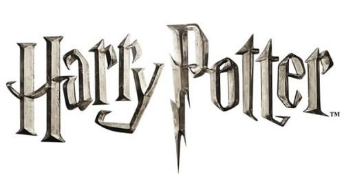
The gold foil Harry Potter emblem was introduced in 2001 but only stayed with the famous brand for a year. It was a bright and chic texture, which made the iconic letter look more elegant and adult. The tail of the “P” on this version was a bit shorter than the original one.
2004 – Today

This emblem was used for various media since 2004. It’s mainly the same wordmark as the one used for the first 2 movies, except it’s completely black. The colors can change, naturally, but it’s been the base for all HP-related products since then.
2004 – 2011
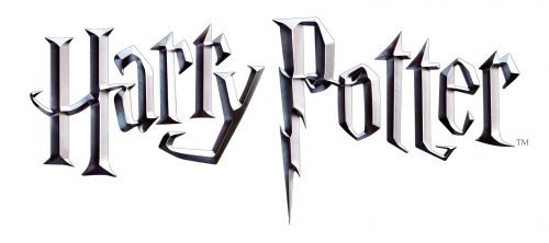
The logo for Harry Potter from 2004 featured a three-dimensional sharp stylized inscription, executed in gradient silver shades with a metallic texture. The letters of the wordmark were placed a bit not even horizontally, with the tails of some symbols elongated and curved. The most distinctive element of the logo is the vertical bar of the letter “P”, which is stylized as a lighting bolt, resembling the scar on Harry’s forehead.
Symbol
It was in the American editions of the series that the now familiar Harry Potter logo was used for the first time. Later, it appeared in the film. The second version of the symbol has remained unchanged until now, except for the color.
Emblem
Unlike many other popular logos, the essence of the Harry Potter logo is not a special symbol but the very font itself. It is one of the very few cases when the typeface itself includes recognizable visual characteristics that make it unique.
Colors
Judging from the fact that the logo can be seen in various colors, the color scheme cannot be considered the most important part of the Harry Potter logo. Some of the colors used for the image over the last few years include shades of golden, silver and black.
Font
Being the essence of the logo, the Harry Potter font deserves special attention. The currently used version of the emblem features a custom-made typeface with graphic elements reminiscent of the world of magic and Harry Potter himself. Here, we can’t but mention the “lightning” in the “P” letter: this graphic element is presumably supposed to be a reminder of the “lightning” scar the main hero of the book had.


