Gravity Falls is the name of the popular animated series, created by Alex Hirsch in 2012. The series tells us a story about two kids’ adventures in a city full of magical creatures. Gravity Falls was broadcast by Disney and had its final episode released in 2016.
Meaning and history
Gravity Falls is an animated series that tells us the story of two twins who go to their uncle’s house for the summer in the country town of Gravity Falls, somewhere on the backwoods west coast of the United States. Unexpectedly, Dipper and Mabel (the twins) discover that the presence of a Mystery Shop under the guidance of Uncle Stan is justified by the vast number of anomalies in the surrounding area: Dwarves, mermaids, unicorns, nine-headed bears, zombies, and other incredible creatures.
Perhaps the main reason for the incredible popularity of the series is that the plot and the world of Gravity Falls are both simple and complex at the same time. On the one hand, we are shown an ordinary adventure of two kids in a town filled with magic, but on the other hand, the world of Gravity Falls is full of delightful colors and details of colors.
It is because of the overabundance of colors that the series logo is rather faded. The logo is bold and easily recognizable, but it has nothing to do with the brightness of the series itself: executed in just two shades, within a very simple concept, the Gravity Falls logo had only one official version, which was used throughout all four years of the broadcasting.
2010
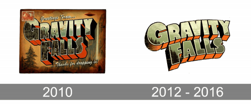
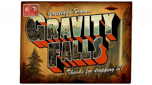
The very first Gravity Falls logo was created in 2010, for the pilot episode. It was a stylized postcard drawn in the green and brown color palette, with the forestal landscape as the main theme. The enlarged logotype was set in gradient green and orange in the center of the postcard, written in the uppercase of a custom sans-serif typeface with massive three-dimensional letters. The uppercase inscription had the first letters of both words enlarged.
2012 – 2016
For the TV release of the animated series, the logo was refined in 2012. And has never been changed since then. The postcard and its background were gone and only the lettering remained. There were two versions: the inscription with the landscape pattern of the letters, or a plain one, with solid military green shade. In terms of shape, the letters of the logotype resembled the ones from the pilot logo but were more rounded and the placement was slightly arched.


