![]() Avengers Logo PNG
Avengers Logo PNG
The famous Avengers “A” (also called the “Big A”) debuted in 1972. It was developed by Gaspar Saladino, a well-known Marvel letterer.
It became the basis for the emblem featured in the movies. Since then, the Avengers logo hasn’t changed that much, except that there’ve been some playing around with the palette.
Meaning and history
![]()
If you take a look at the cover of the Avengers comics #96 published in 1972, you’ll recognize the now iconic large “A” with an arrow on the right end of its horizontal bar. While the arrow looks slightly different than in the movie, it already has its recognizable style. In the course of time, Marvel has replaced or modified the logo many times, but it’s the 1972 “A” that was chosen as the basic element of the logo for the Avengers movies.
The author of the design was Gaspar Saladino, who was known as Marvel’s “First page letterer” in the 1970s.
2012
![]()
This is the basic version of the Avengers symbol replicated in all the following movies. Probably the most characteristic element of the logo is the initial “A.” Its left bar is elongated, while the horizontal bar looks like an arrow. Also, the letter is partly placed inside a ring, which adds dynamism. Over the horizontal bar, the lettering “THE” can be seen, which belongs to the name of the movie.
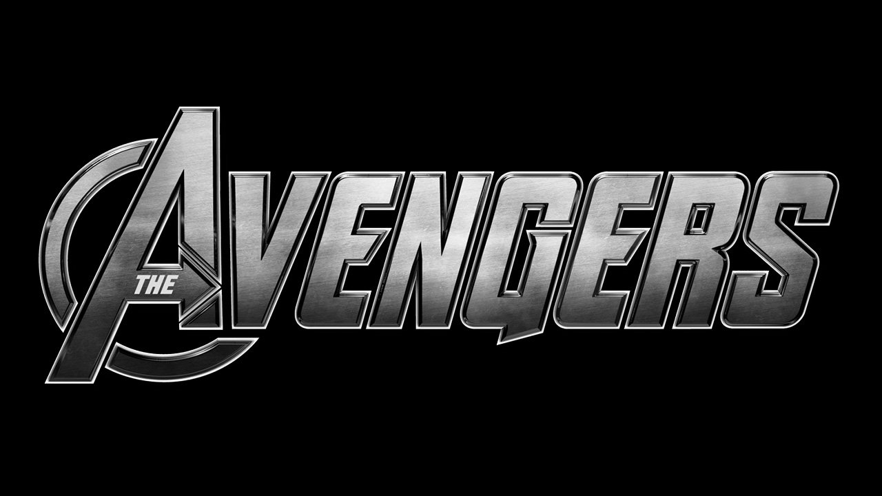
Another highly distinctive letter is the “G.” The lower end has a characteristic sharp shape. Both the “E’s” have an unusual middle bar ending with a sharp angle. All the letters are slightly sloped to the right.
Above the name of the movie, the word “Marvel” can be seen. It’s given in its regular palette: the letters are white, while the background is red.
On the whole, the typography has a dynamic and tech feel.
2012 – Today
![]()
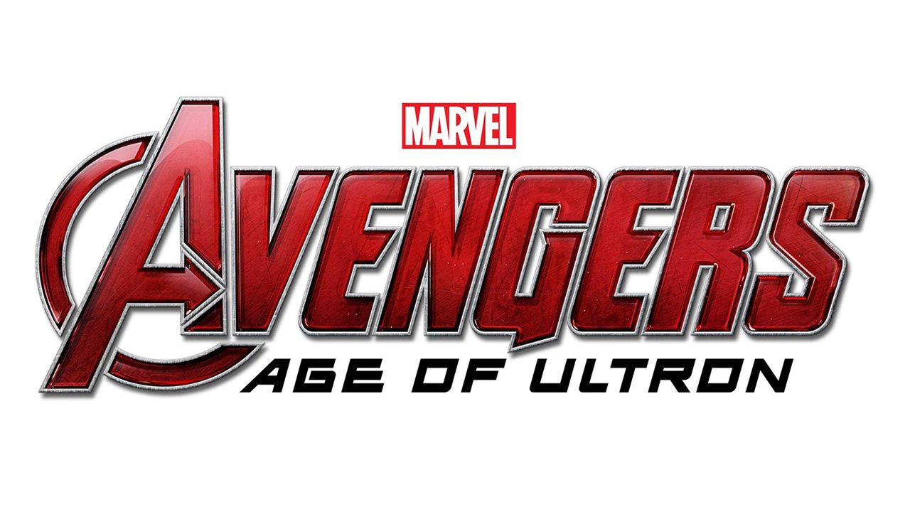
The logotype was redrawn flatly in 2012. The color palette was simplified to black on white, with all the gradients removed from the badge. As for the typeface and style, it was not changed at all, though the same letters in black looked cleaner, more massive, and powerful than the silver version created earlier. Also, in this black and white emblem the arrow on the Avengers’ signifier, its letter “A”, was more readable and visible.
2015 – 2017
![]()
Apart from the palette and the lettering “THE” that has disappeared from the horizontal bar of the “A,” the Avengers logo looks the same as in the original movie. Under the main emblem, you can see the name of the episode in smaller letters. The letters are white with a light grey gradient. The type in both the parts of the logo is slightly sloped to the right. The word “Marvel” looks exactly as in the previous version of the logo.
2018
![]()
This time, the designers had to sacrifice part of the ring on the letter “A.” Due to this, the name of the episode, “Infinity War,” is larger and better legible than on the posters for the 2015 film. This time, the name of the episode isn’t italicized, while the word “Marvel” on top of the logo is accompanied by the text “Studios” in white.
![]()
2019
![]()
The lower part of the ring on the “A” returns to the logo, which can be probably explained by the shorter name of the episode. The word “Endgame” is italicized and doesn’t look very legible because of the gradient and color. Apart from these elements and the palette, the Avengers Endgame logo replicates its predecessors.
![]()
Avengers and their personal logos
Iron Man (Tony Stark)
![]()
There are two logos: the Iron man mask and a more intricate roundel emblem. The mask has a pretty complex shape and consists of two parts. The other Iron Man logo is a double triangle inside a roundel.
Hulk (Bruce Banner)
![]()
The Hulk logo is a large clenched fist inside a circle. The fist and the outline of the circle are green, while the background is black. There’s also a Hulk radiation logo given in black and green.
Captain America
![]()
The Captain America logo has a patriotic look due to the star symbol and the palette inspired by the US flag. While there have been some playing around with the size of the star and the number of rings around it, the emblem has been pretty consistent in its patriotic core.
Thor
![]()
Typically, the Thor logo is a hammer inside a circle. The hammer may or may not feature lightning bolts and a three-leaf flower.
Black Widow (Natasha Romanoff)
![]()
One version of the Black Widow logo is an hourglass shape, which sometimes houses the black widow spider. Also, on her chest, Natasha Romanoff wore a roundel emblem depicting a bird’s head and part of its wings.
Hawkeye
![]()
The Hawkeye logo features a bow, which seems pretty natural taking into consideration that the S.H.I.E.L.D. agent is a master archer. The main color is purple, while black and white can be used as additional colors.
Colors
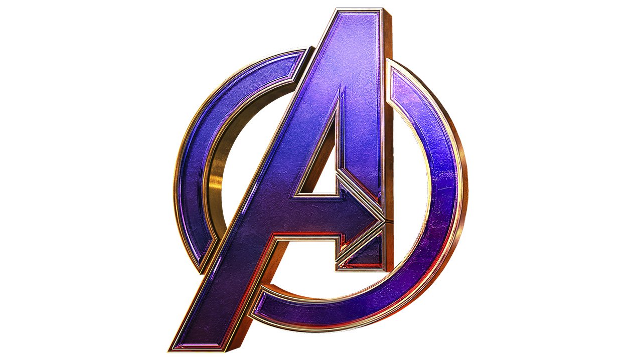
The palette of the main Avengers logo has undergone multiple transformations throughout the history of the movie. It has gone from orange and yellow to neon blue, red, and light grey. The reason is quite simple: it’s not the kind of logo where the color plays an essential part. The palette has always been adjusted to the colors of the visual context where the logo was placed.
For instance, on the movie poster for the 2012 film, the emblem features white, light grey, and blue gradient, which perfectly fits the colors of the sky and buildings, as well as the grey hues of the heroes’ costumes. By contrast, the poster for the 2019 movie is dominated by purplish tints, so they have been chosen for the logo, too.
Font