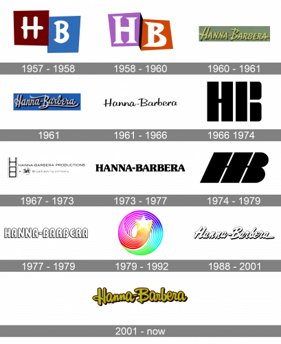
Hanna-Barbera Productions, Inc. was a Los Angeles-based animation studio and production company. During almost half a century of its history, the Hanna-Barbera logo went through around 15 modifications. In many cases, the company just dropped its old logo completely to introduce a totally new one, where nothing brought to mind of its predecessor.
Meaning and history
Hanna-Barbera is a legendary American studio, which was established in 1957, and named after its founders, William Hanna and Joseph Barbera. Throughout the years the company has released dozens of super popular shows and projects, such as Tom and Jerry, The Flinstones, Scooby Doo, The Smurfs, and many many others.
In 1991 the company was bought by Turner Broadcasting, which in 1996 became the property ofTime Warner.In 1992, Hanna-Barbera created Cartoon Network, under which all the company’s projects are carried out today. As for Hanna-Barbera itself, it ceased to exist in 2006, after the death of Joseph Barbera (William Hanna died in 2001).
What is Hanna-Barbera?
Hanna-Barbera is the name of a former animation studio, which was established in Los Angeles in 1957, and ceased all operations in 2001. The studio specialized in such projects as cartoons, tv films, series, commercials, and others.
1957 – 1958
The company was founded in 1957 by William Hanna and Joseph Barbera (who created Tom and Jerry) in collaboration with film director George Sidney.
The original emblem sported the letters “H” and “B” inside maroon and light blue boxes respectively. The shape of the boxes was close to the square and the rectangle but, in fact, they were more of irregular quadrilaterals. The glyphs also had a playful irregular shape.
1958 – 1960
The logo grew even more carefree. Both the boxes and the letters became more irregular. The colors, too, were replaced by brighter and more eye-catching ones.
1960 – 1961
This time, the brand owners decided that just the two initials were not enough. The full name of the company was placed over a warm green background. The type was inspired by handwriting.
1961
The type remained “handwritten” but adopted several picturesque curls.
1961 – 1966
The same year, a simple logo was introduced. The lettering still seemed to have been written by hand but looked more minimalist now.
1966 – 1974
The majority of projects released during the following six years featured the huge letters “H” and “B” in a heavy typeface. The designers successfully played with negative space, which created an unusual and stylish result.
1967 – 1973
For less than a year, you could come across a version where the lettering “Hanna-Barbera” was paired with a stylized depiction of a film.
1973 – 1977
Once again, the initials were replaced by the full name. This time, a font with rounded serifs was chosen.
1974 – 1979
Just a year later, the time of a two-letter logo came again. The glyphs looked somewhat similar to the 1967 version but were italicized, which made the design more dynamic.
1977 – 1979
And again, the writing “Hanna-Barbera” appears. This time, the type is drastically different than in any other “full” wordmark used earlier, although the friendly rounded style is preserved.
1979 – 1992
The so-called Swirling Star was created by Art Scott. It appeared in various projects until 2001, along with other emblems.
1988 – 2001
A pretty generic “written by hand” version was unveiled.
2001 – Today
The current Hanna-Barbera logo was also inspired by handwritten words. It has a fun carefree style.
Font and Color
The smooth and bold cursive lettering on the primary badge of Hanna-Barbera is set in a custom soft typeface with rounded contours of the title case characters. The closest fonts to the one, used in this insignia, are, probably, Yasminda Extrude, or Feltro Shadow, but with significant modifications of the letters’ contours, with the addition of thick outlines and shadows.
As for the color palette of the Hanna-Barbera visual identity, it is based on a calm yet the intense combination of khaki and brown, which looks very reliable and confident, at the same time evoking a sense of trustworthiness and responsibility.


