

![]() Scooby Doo Logo PNG
Scooby Doo Logo PNG
Scooby-Doo is one of the world’s most famous media franchises, which started at the end of the 1960s with animated series, and today has quite an impressive lineup of series and movies, along with toys, books, and all the possible branded accessories.
Meaning and history
![]()
The Scooby-Doo franchise began in 1969. Over the more than 50 years of its existence, the Scooby-Doo franchise has spawned many animated films and projects, from the very ordinary, like the very first Scooby-Doo cartoon series, Where Are You!, to the unusual crossover with Supernatural.
The original idea for the series was that the five musician friends: Jeff, Mike, Kelly, Linda, Linda’s brother “WW” and their dog — solve mysteries and crimes involving zombies, aliens, and ghosts in between gigs. CBS Channel executive producer Fred Silverman demanded that the title be changed from Who’s S-S-Scared? to something more lively, and the writers of the idea decided to redesign the entire series, focusing specifically on Shaggy and Scooby, the funniest characters.
The series got off to a full start in 1969 with the title “Scooby-Doo, Where Are You?” and ran for two seasons of 25 episodes. In the beginning, there was a classic plot and drawings with a simple “1 monster per 1 episode” idea. The non-linear plot allowed viewers to join the show at any point and not lose the thread of the narrative. Then from 1972 onward, the New Scooby-Doo Movies (or the New Scooby-Doo Cases) were released separately and consisted of two seasons and 24 episodes.
In 2002, Raj Gosnell’s Scooby-Doo was made, based on the script by James Gunn. In the story, the team breaks up but reunites two years later to solve another mystery case on Sinister Island. The sequel “Scooby-Doo 2: Monsters on the Loose” did not take long and came out two years later in 2004.
As for the animated series, a radical change in the drawings took place in the reboot of “What’s New, Scooby-Doo?” in the early 2000s. The plot became more diverse, the drawing became more complex, the number of secondary characters expanded, and the monsters became more familiar to modern viewers.
What is Scooby-Doo?
Scooby-Doo is a famous American media franchise, which was introduced in 1969. The franchise is based on stories about a group of young detectives and their talking dog. Scooby-Doo is much more than just a cartoon series, it is a real cartoon universe with endless changes, upgrades, and collaborations.
In terms of visual identity, the Scooby-Doo franchise has changed its logo for each new season of the series, using bold handwritten wordmarks and mostly bright colors. The version, created in the end of the 1990s, is the most ornate one, as apart from the lettering, it also features an image of the main character.
1969 – 1972
![]()
For the franchise debut in 1969, the logo was set in extra-bold white letters with slightly wavy contours. All characters were jumping above the line, and had somewhat of a “spooky” mood, resembling ghosts silhouettes, flying above the ground. The white inscription was set on a dark background, adding more drama to the composition.
1972 – 1976
![]()
For the second series, released in 1972, the Scooby Doo logo was redesigned with more brightness. The lettering was set in heavy geometric characters, overlapping each other. All characters were colored gradient green and set on a plain bright-blue background. The geometric shapes of the letters were softened and had their bold contours smoothed.
1976 – 1979
![]()
The redesign of 1976 has introduced a refined Scooby-Doo logo in a new color palette. The lettering was set in bold white characters with thick black outline with n a bright purple background with smooth pink gradients. This time the characters were drawn flat and had their shapes more straight and strong.
1979 – 1985
![]()
In 1979 the Scooby-Doo logotype was rewritten in a more traditional typeface with clean distinctive contours of the uppercase sans-serif characters. The letters were colored in flat yellow, and had a black outline with black shadows. This time the wordmark was split into two levels and set on a plain white background.
1985 – 1988
![]()
The redesign of 1985 has brought back the spookiness to the Scooby Doo visual identity, introducing a completely new lettering, set in gradient green on a bloody-red background. Again, each character was drawn in ghost-like shapes, with some of the lines elongated.
1988 – 1991
![]()
For “A Pup Named Scooby-Doo” series, the designers used a more traditional typeface, which looked very friendly and kind. The geometric inscription with heavy characters was set in brownish shade with white outline, and placed on a bright green and blue background.
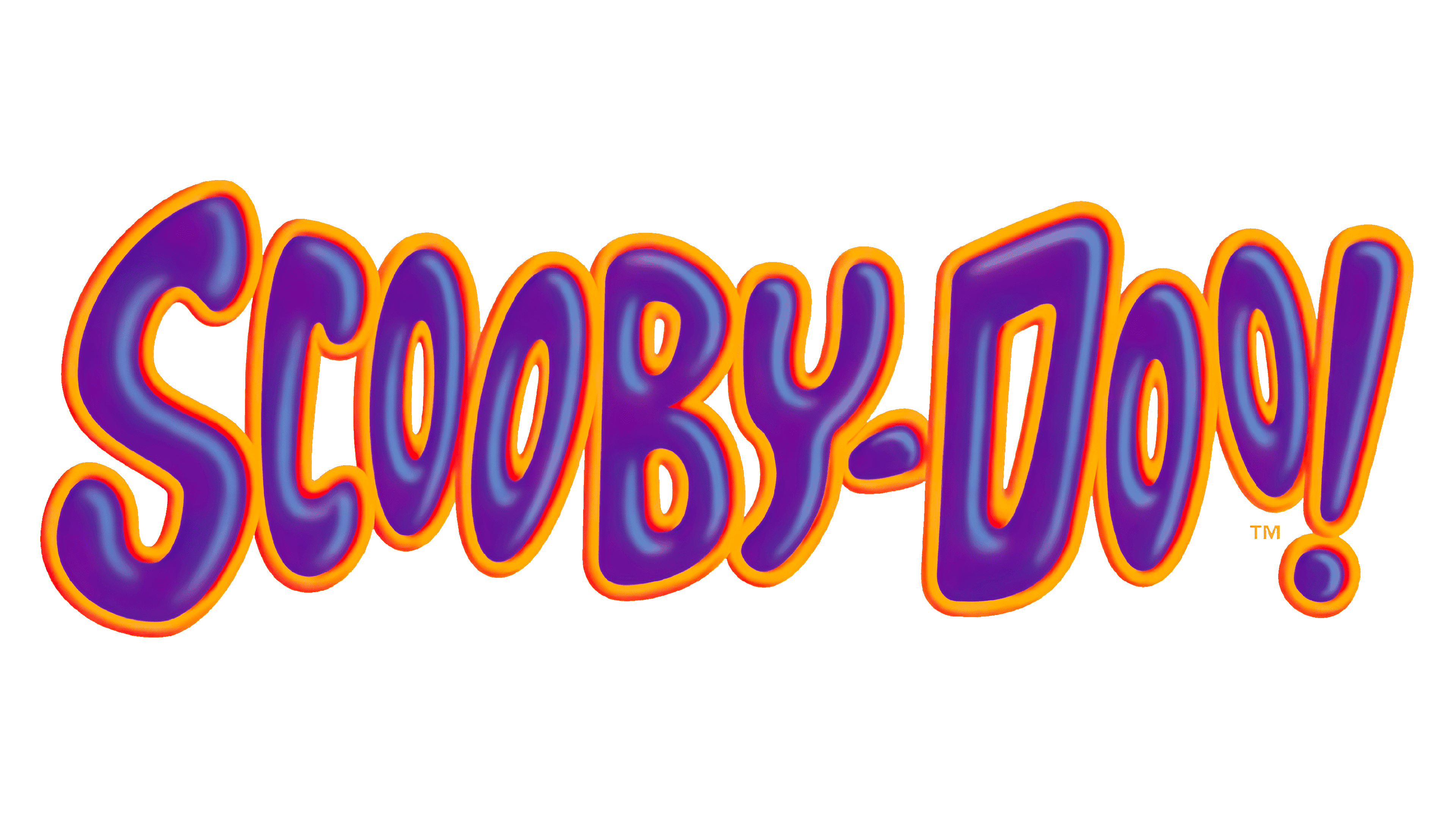
1997 – Today
![]()
The redesign of 1997 has created the brightest and the most ornate Scooby-Doo logo version, which is still used by the franchise today. It is composed of a voluminous purple and orange inscription, with the drawing of Scooby-Doo, peeking out from behind the lettering and widely smiling. The glossy surface of the letters adds the 3D feeling, while the main character is drawn in the traditional manner.
Font and color
The bright and bold lettering from the primary Scooby-Doo logo is set in a hand-drawn designer typeface, which doesn’t have commercial analogs, but could be compared to such fonts as Splashdown, or Surfer Shop BTN Cond, with the softened contours.
As for the color palette of the Scooby Doo visual identity? It is based on the combination of bright and intense shades of purple and orange for the lettering, and smooth brown tones for the graphical part.


