Google Calendar is Google’s free coordination platform, which was designed in 2006 and became available in the original package in 2009. The software is suitable for both personal and group use and allows you to create multiple calendars for different types of events and subscribe to your friends’ and colleagues’ calendars.
Meaning and history
Google Calendar stands out among its peers with a wide range of various additional features. This Google platform offers the most versatile time-management tools at the moment for everyone without exception, from absolute rookies to active enthusiasts.
To start using Calendar, you need to sign up for a Google account. If you already have an account, just sign in. The site works directly in your browser, so you don’t need to download any apps on your PC. It is impossible to create a new calendar from a mobile device, in a browser, without an app, but you can use the existing one easily.
As the service is not new, there have been several visual identity redesigns held throughout the years, in different styles and compositions.
2006 – 2009
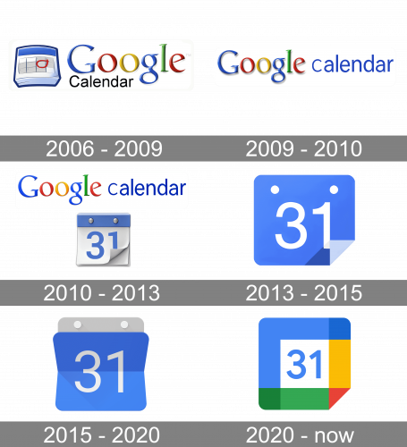
The very first Google Calendar logo was created in 2006 and stayed in use by the company for almost three years. It was a badge based on the official Google logotype in three-dimensional serif letters, accompanied by whether a sans-serif “Calendar” underline, or a graphical emblem on the left. In the case of the emblem, it was drawn in white and blue, with one square outlined in red.
2009 – 2010
The redesign of 2009 removed the graphical part from the badge, making it simple laconic and professional. Now the blue sans-serif “Calendar” in the lowercase was placed right after the Google logotype, executed in the corporate style, with the letters in blue, red, yellow, and green. This minimalist concept was only used for a few months.
2010 – 2013
In 2010 the logo, created in 2009, was accompanied by the graphical emblem, which was used on its own, as the software’s icon. It was an image of a calendar in white and blue, which was drawn three-dimensionally and had its first page’s corner folded. The page had a bold “31” on it. In the same period, another emblem was also used by the Google Calendar. A diagonally placed dark blue square with two solid dots on top and a white “31” in the center.
2013 – 2015
The blue calendar was redesigned in 2013, being placed straight and getting the bottom right corner folded. The contours of the image were refined and the color palette enhanced, so the whole badge started looking very modern and professional. No lettering was used in the new concept, just an icon.
2015 – 2020
The redesign of 2015 introduced a new three-dimensional version of the Google Calendar logo. It was still a blue and white image, but this time not the corner of the paged but the whole page was slightly folded, with the upfront inclination. This light gray element appeared on the background, having two solid white dots placed along its upper border.
2020 – Today
A colorful and fresh logo was created for Google Calendar in 2020. The new concept is based on the Google corporate visual identity, with the colorful yet strict and laconic frame, set around a white square with the blue “31” on it. The frame, formed by four elements (blue, yellow, green, and red), has three of its corners rounded and the bottom right one diagonally cut.


