Microsoft Teams is one of the Microsoft Office pack products, released in 2011, and is designed to communicate, brings colleagues and partners together, and includes the tools teams need to work together productively. The integrated cloud-based Microsoft Office 365 solution will simplify IT infrastructure, improve data security and provide automatic updates of Office application features.
Meaning and history
Microsoft Teams is actually a group chat for Office 365 users. Allows you to create groups/rooms for projects or departments, communicate, share files with colleagues. There are bots for notifications and responses to requests. Tight integration with Microsoft applications — Skype, Word, SharePoint, OneNote, Power BI, Planner.
In 2021 Microsoft has closed its Skype for Business, which was fully replaced by Microsoft Teams. The product has all the functions that may be needed for productive teamwork.
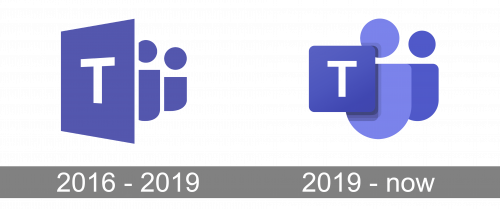
As for the visual identity of the software, it hasn’t changed much since the day of the initial design. The color palette and idea of the insignia have remained the same, just the contouring and minor details were modernized throughout the years.
2016 – 2019
The initial Microsoft Teams logo was created in 2016 and stayed untouched for almost three years. It was a badge in the intense yet calm shade of purple, composed of a vertically oriented rectangle, placed in ¾, with the bold white capital “T” on it, and two abstract figures, reminding letters “I” with solid dots replacing heads and the vertical bars rounded at their bottoms. The second figure was shorter and wider than the first one. The whole composition was placed on a white background.
2019 – Today
The Microsoft Teams logo was refined in 2019, keeping the purple and white color palette, but intensifying the dark shade and adding a lighter one to one of the elements of the badge. The rectangle in ¾ turned into a square with rounded angles, which was now placed upfront. The square is shadowed and set over the enlarged light-purple figure, which got widened up. The second figure got smaller and is executed in the same dark purple, as the square with the thin white capital “T” on it.


