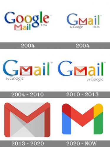
One of Google’s most popular products, the Gmail service has gone through more than one logotype since the introduction of its beta version around 15 years ago. In spite of their differences, all the logos have always been based on the same “Envelope M” theme.
Meaning and history
The project was developed by Google employee Paul Buchheit, who started working on it in 2001. He made the first version of the product in one day, as it was based on the code of his earlier creation, Google Groups.
Originally, the service was used within the company. By the time of the public release in 2004, around 12 people were working on it.
What is Gmail?
Gmail is one of the world’s most popular electronic Mail platforms, which was developed by Google at the beginning of the 2000s. The work on the platform started in 2001, but the public saw the final result only three years later, in 2004
Old logo 2004
The original logo was created by Dennis Hwang, who made almost all of the Google doodles at the time. Interestingly enough, the logo of Gmail was developed literally the night before the launch of the service.
2004
One of the earliest logos showcased the word “Gmail” accompanied by the word “Beta” in the lower right corner and the words “By Google” in the lower left corner.
2004 – 2010
The original logo for Gmail featured a combination of the Catull type (for the “G”) and the Myriad Pro type. Catull was chosen as it was the font of the main Google logo. Yet, the lowercase “a” in the typeface looks somewhat strange, so Hwang decided to choose a cleaner sans-serif type for all the other letters.
2010 – 2013
It’s not that easy to spot the difference between the 2004 and the 2010 versions unless you compare them side by side. The 2010 emblem has the text “by Google” aligned to the right side, as well as somewhat different colors and proportions.
2013 – 2020
The 2014 logo made its debut on the mobile application version of Gmail. In line with contemporary logo design trends, it looks sleeker and more minimalistic than its predecessor. The “M” that appears as a little envelope is the distinctive feature of the design. While in the previous versions, the “Envelope M” was incorporated in the word “Gmail,” now it acquired the status of an independent symbol and can be used not only with the “Gmail” text but as a standalone icon, too. Even when it is a part of a larger logo, the “M” is no more incorporated into the name of the service but placed before it.
2020 – now
The redesign of 2020 made the Gmail logo stronger and more eye-catching. The iconic white and red envelope is replaced by a stylized letter “M”, standing for “Mail”, in the official Google colors — blue, red, yellow, and green. The letter is formed by four segments, and two of them (blue and red) are overlapping.
On the right from the new icon, a simple gray wordmark in a delicate and neat sans-serif is placed. The calm color and traditional shapes of the letters balance a bold and bright emblem, making the whole logo look professional and strong.
Icon
Throughout the years, the famous mail service of Google has been using a red and white envelope as its icon. It was a very direct and simple representation of the application purpose, which could be used on its own or as a part of the official Gmail logo.
After the redesign of 2020, the Icon of the service has changed dramatically. In parallel with the Google icon, the Gmail one is now a bold stylized letter “M”, which repeats the shape of the envelope, composed of five segments, each in its own color — blue, dark red, classic red, yellow, and green.
The Gmail Icon is an example of corporate style and traditions, though its bright and sleek execution shows the progressiveness of the service and its ability to not only follow but also to create trends.
Font
 While the typeface featured on the Gmail logo doesn’t look very unusual, it’s probably a custom work created from scratch specifically for the company. The most distinctive feature of the type used on the Gmail new logo is perhaps the “G” with a somewhat shorter than usual top end.
Color
While historically, the Gmail logo image was built of all the colors used in the logo of its parent company, today, it only includes red, grey, and white as the background color. Both red and grey have several shades, which is necessary for creating the 3D effect.
Why is there a new Gmail logo?
The new Gmail logo was created for the email service in order to support the corporate Google style and color palette, with the solid red outline of the white envelope replaced by a recognizable combination of blue, red, yellow, and green. Also, the letter “M”, hidden in the contour, became more visible now.
What is the new logo for Gmail?
The new logo for Gmail is based on the previous version of the service’s badge, a gradient white envelope in a contrasting outline. The outline forms a bold and extended letter “M”, standing for “Mail”, set in the corporate Google palette — blue, red, yellow, and green.
When did Gmail change its logo?
The last redesign of the Gmail logo was held in 2020, but before that, the badge of the online email service, owned by Google, was redesigned four times. The latest changes were made to the icon to support the visual affiliation of the service to its mother company.


