Duolingo is the name of one of the most popular language-learning applications, which was introduced in 2010. The app, offering courses in more than 30 languages, has hundreds of millions of users all over the globe and is considered to be very effective.
Meaning and history
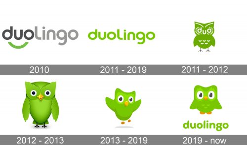
he visual identity of Duolingo is composed of two parts — a minimalist and laconic logotype, executed in a bright, acid color, and a fun playful mascot image, which can be seen on the app and web icons, advertising materials, and sometimes near the logotype.
2010
The very first logo for Duolingo was created in 2010, but stayed almost unnoticed for users, as was a part of the application’s beta version. The logo featured a two-colored inscription in the lowercase, where the darker “Duo” part had an arched green underline, resembling a smile. The “Lingo” lettering was drawn in light gray, a color standing for professionalism and expertise.
2011 – 2019
The redesign of 2011 simplified the logo, making it all green and removing the “smile” element. The typeface of the inscription hasn’t been changed, as was perfectly reflecting the character and purpose of the application, evoking a sense of friendliness and trustworthiness with its rounded shapes and smooth lines. Along with the green version of the logo, the secondary one, in gray, was used by the company during this period.
2011 – 2012
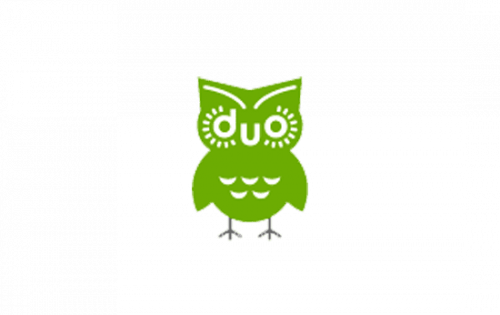
The first Duolingo owl was introduced by the company in 2011 and stayed as the official emblem for a bit less than one year. It was a simple flat green image with the face of the bird stylized as the lowercase “Duo” inscription. The owl had small white dative drawn over its head and body, and thin black legs, which looked slightly imbalanced to the body. The lowercase “D” and “O” made up two eyes of the bird, while the “U” looked like a smooth large beak. It was a cool inscription of the application name into a graphical emblem.
2012 – 2013
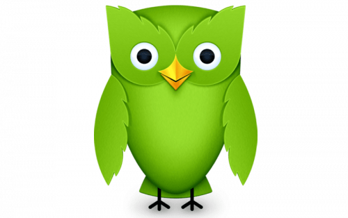
The redesign of 2012 redesigned the owl image, removing the stylized logotype from the bird’s face. The mascot was now drawn three-dimensionally, in bright green gradients, and was looking kind and friendly, welcoming the new users to join the application. The owl as the symbol of wisdom was a really good choice for the mascot of the educational application, and its green color, standing for growth and progress, only enhanced the meaningfulness and recognizability of the badge.
2013 – 2019
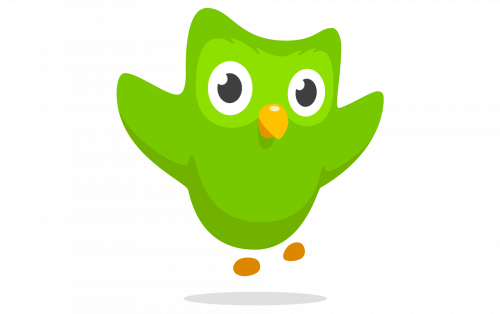 In 2013 the Duo was redrawn in a flat manner, which made it look friendlier and kinder. The owl was jumping and dancing, evoking a smile.
2019 – Today
In 2019 the logo was redesigned again, keeping the bright green color as the main, but changing the style of the lowercase wordmark. The new custom typeface of the Duolingo logo is fancy and elegant and resembles feathers with its unique ends of the letters, smooth and pointed.
Font and color
The unique Duolingo logotype is executed in a custom sans-serif typeface, which is based on one of the traditional rounded fonts, such as Torus Bold or Auro Bold, but with the lines of its letter modified. The letter “G” of the inscription is the most out-standing and elegant, with its tail rounded and its upper part having a fancy feather-like curve.
The bright green color of the Duolingo logo is a symbol of growth and development. The language-learning application aims to provide users with the best system of remembering foreign words, guaranteeing progress, and a good result. And the light shade of green brilliantly represents the character and mood of the company, along with its purpose.


