Geo is the name of a discontinued automaking brand, which was established in the United States in 1989 and ceased all operations in 1997. The company was specialized in the production of microcars and SUVs and has released five different models throughout its history.
Meaning and history
Geo was a short-lived Chevrolet brand, which produced its cars based on other brands’ models. Thus, Geo Prizm was a copy of Chevrolet Nova, and Geo Metro — of the Suzuki Swift. Despite its simple approach to automaking, and only eight full years of existence, the brand managed to create two interesting logo concepts, which were equally used on the cars and printable materials.
The first Geo logo featured a horizontally stretched globe, enclosed into a thin oval outline. Inside the globe, there was an iconic Chevrolet crossbow symbol placed with thin spaces between it and the lines of the badge. The logo was usually executed in a blue and silver palette and looked pretty modern and elegant.
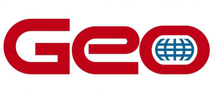
The second emblem looked a bit more contemporary and consisted of a custom Geo lettering in a title case with the negative space of the letter “O” stylized as a globe. On this version, no Chevy crossbow was used, though the resemblance with the original version was still strong enough, as the letter “O” was also horizontally stretched and got an ellipsoid shape.
The text-based logo was available in three major color combinations — monochrome, red, blue and white, and silver with black. Throughout the years the lines of the letters became bolder and smoother, which made the look of the badge, placed in the Geo cars, more confident and serious.
What is GEO?
GEO, a division of a larger automaker, specializes in compact and fuel-efficient vehicles. Launched to cater to a growing market for smaller cars, GEO’s lineup includes both conventional and electric models. Their cars are known for practicality and affordability, appealing to urban drivers and eco-conscious consumers.
Font and color
The Geo logotype was executed in a unique sans-serif typeface with a smooth futuristic look, which was designed exclusively for the brand and reflected its “Geographical” name. The soft thick lines of the letters, rounded angles, and the open contours of the “E” made the emblem recognizable and memorable. The Geo typeface was probably based on such fonts as Stereo Gothic and Good Timing Semi Bold, but with the lines extended and modified.
Geo had its official logo executed in three color palettes — monochrome, which is a timeless elegance and a reflection of stability and professionalism; silver and black, which was mainly used for car badges and had its glossy metallic surface balanced by the black and silver globe inside the “O”; and red with blue and white, a passionate and bright combination, standing for strength, safety, and loyalty.
As for the initial globe and the crossbow badge, its silver and blue color scheme looked fresh and delicate, evoking a sense of trustworthiness and responsibility for the brand.


