Friendster is the name of one of the world’s first social media platforms. Introduced in the middle of 2002, already a year later the company received an acquisition offer from Google, yet it was declined. The social media had quite a good start, yet the competition in the market was constantly growing and it led to the closure of the project. Yet in 2024, the project was relaunched, with a rethought concept and visual identity.
Meaning and history
While the Friendster logo went through at least three notable modifications, it always preserved its mood, which was very friendly, relaxed, and optimistic. In other words, it perfectly fitted the company’s mission and the field, where it worked.
2002 – 2009
The original logo showcased a smiling face slightly tilted to the left. Next to it, there was the word “Friendster” set in a simple sans serif typeface. All the letters were lowercase. The logo could be given either in black or in blue over the white background.
2009 – 2011
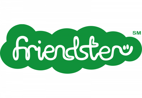
The following version was quite illegible. The name of the company was set in a unique cursive script. It had a laid-back and uplifting mood. And yet, you could hardly figure out what the name of the brand was unless you already knew it. Taking into consideration excellent brand awareness the company could boast by that time, this design looks comparatively acceptable.
The “smiling face” theme was preserved here in a modified style. The end of the “r” glyph was extended and curved to form a smile. Above it, there was a pair of dots imitating the eyes.
The wordmark was placed inside a solid green cloud. There was also a darker version, where there were plenty of bubbles.
2011 – 2015
The last version looked pretty much like the original one and had nothing to do with the 2009 logo. The experiment with the illegible wordmark didn’t prove successful.
Once again, you could see the name of the brand in an austere sans featuring lowercase letters. Once again, there was a smiling face tilted to the left. Yet, this time, there were three more smiling faces, all featuring different colors.
All the faces were now drawn with more detail, while the type looked more compact.
2024 – Today
The redesign of 2024 has brought the original idea of the Friendster logo, yet made it look more modern and suitable for digital usage. First of all, the color palette now features a darker and calmer shade of blue, which looks more professional and reliable. Secondly, the lowercase wordmark was rewritten in a bolder sans-serif typeface with more compact shapes of the characters. And, thirdly, the emblem was also modified and the circular emoji started looking more balanced.
Font
The logo has always been dominated by green or blue. Additional colors included orange, red, and black.
Colors
The last Friendster logo opted for a perfectly legible although not that unique font without the serifs and any decorative elements.


