Fortnite is one of the most popular video games, created by EpicGames in 2017. The label earns its popularity quite fast and today it has more than 100 million players across the globe. One of the most successful video-games releases of the 2000s.
What font is used for the Fortnite logo?
The logotype of the famous video game is executed in a bold modern Sans-serif typeface, which is called Burbank Big Condensed Bold. The font was designed by Tal Leming and is pretty close to such fonts as Floki Extra Bold and Niko Extra Condensed Bold, but with the horizontal lines modified.
Meaning and history
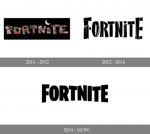
The visual identity of the famous online shooter has only been changed twice since the release of the game in 2011. And the current Fortnite logo is the most minimalist and clean among all three versions, though it’s instantly recognizable across the globe and looks professional and very modern.
2011 – 2012
The original Fortnite logo featured a bold yet a bit clumsy logotype, with its thick and massive letters executed in an uneven color palette and texture. The lines of the letters were also uneven, and the inclination of some parts to different sides made the whole logo even more complicated. The wordmark was placed on a black background and had a shiny yellow moon placed above the letter “I”.
2012 – 2014
The redesign of 2012 simplified the overloaded version of the logo, drawing in in monochrome, with the bodies of the letters in white, featuring gray and black accents, which created a wood pattern, and the black solid screws on each letter, complementing the “lumber” theme. As for the shapes and lines, the letters of this version looked elegant and clean, evoking a sense of style and value of quality.
2014 – Today
In 1014 the logo was redrawn again, and its fancy wooden letters were rewritten in a sleek and solid sans-serif, which was designed exclusively for the video-game. The color palette remained monochrome, though for the secondary versions the brand uses turquoise and white or black and gold combinations, which look fresh and progressive.
Font and color
The custom sans-serif typeface of the Fortnite logo has its massive and solid letters slightly narrowed, and their upper lines unevenly elongated and diagonally cut. Though the font was designed for the brand, it was based on Floki Extra Bold or Golary Red Exbo Caps.
The monochrome color palette of the online-games visual identity makes the brand look confident and professional, and when accompanied by a secondary logo or additional emblems in bright colors, the image looks young, crispy, and progressive, pointing to the audience of the game and their interests.


