

![]() Frederick Keys Logo PNG
Frederick Keys Logo PNG
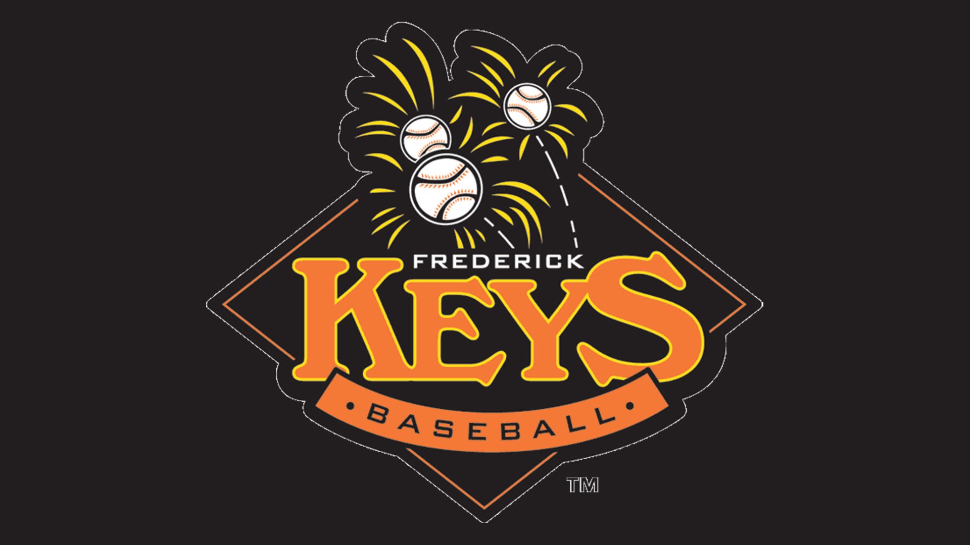
The logo of the baseball franchise Frederick Keys conjures up images of bright fireworks late at night.
Meaning and history
![]()
The history of the franchise started in 1989 when the Baltimore Orioles relocated their Class A affiliate to Frederick, Maryland. Now, it’s the Class A-Advanced affiliate of the Baltimore Orioles. The team is named after the poet Francis Scott Key, who was born in Frederick County.
![]()
Symbol
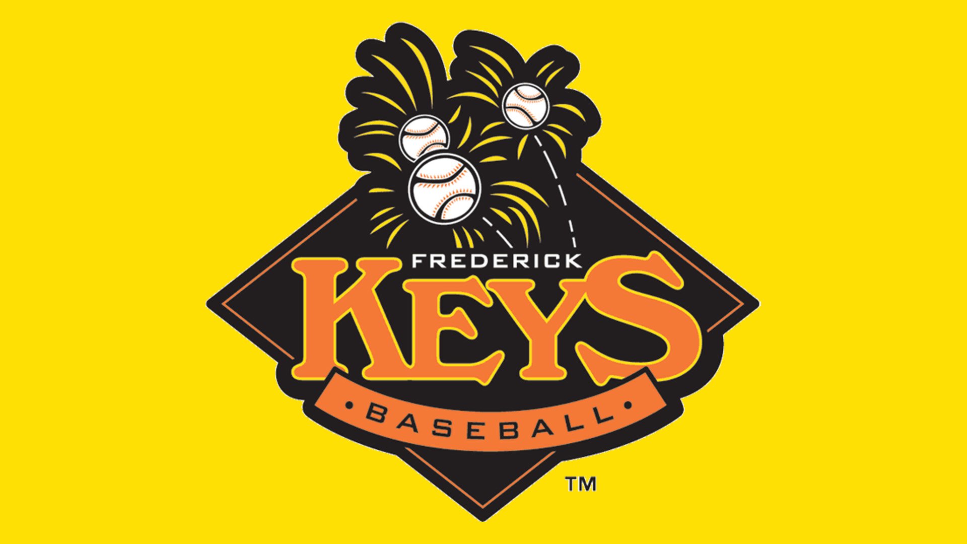
The franchise has been very consistent in its visual brand identity – in fact, the Frederick Keys logo has been the same since 1989. Based on a rhombus, it depicts three white baseballs with black and orange seams. Each of the baseballs is surrounded by bright yellow strokes making them look like fireworks. The choice of colors – orange, yellow, white, and black, only reinforce the image of night fireworks.
Cap emblem
A large “F” in orange is placed over a yellow and orange star. The background is black.


