Filmation Associates used to be a rather well-known production company releasing animation and live-action programming for TV. It was headquartered in Reseda, California.
Meaning and history
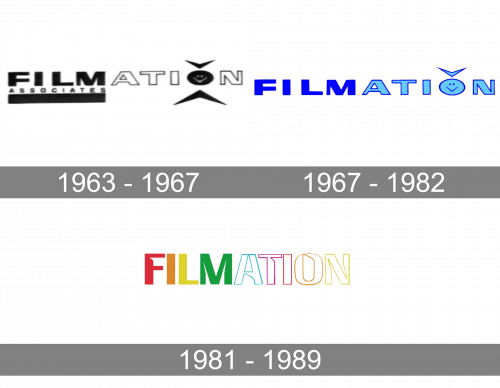
The company worked from 1963 to 1989. It updated its logo at least three times during this period.
1963 – 1967
The earliest Filmation logo was the most cluttered one, too. The word “Filmation” was set in a bold sans serif type built up of strokes of two different widths. The lettering “Film” was separated by the second part of the word with the help of the color.
The “o” glyph was the most peculiar one – it was made up of a smiling face with a tick above. There was a larger tick below, which was turned upside down.
Also, you could see the word “Associates” below the writing “Film.” Below it, there was a thick horizontal bar.
The structure of the logo somehow did not let the eye run smoothly along but made you stumble.
1967 – 1982
While the design preserved its original character, it went cleaner, too. This was the result of the disappearance of the word “Associates” and the bar. The tick below the “o” was gone, too.
The logo still featured two colors (a darker blue for the first part and a lighter blue for the second).
1981 – 1989
This version was somewhat reminiscent of the previous one. It also featured only the name of the company in a heavy sans with the strokes of two widths. This time, however, the proportions of the letters were different (they became elongated). The design team decided to add an unusual touch with the help of white gaps on the glyphs.
The palette of the Filmation logo was now richer. The first four letters were solid (red, orange, yellow, and green), while the following glyphs were white with colorful frames.


