 Extended Stay America Logo PNG
Extended Stay America is an American hotel-chain company, which was established in 1995 and today has more than 600 locations across the USA and Canada. The brand is focused on low-budget long stay rooms.
Meaning and history
Extended Stay America was founded in 1995 by George D. Johnson, Jr., and Wayne Huizenga. This inception marked the beginning of a journey that would significantly impact the hospitality industry, particularly in the domain of extended-stay lodging. Focused on providing accommodations for travelers requiring stays longer than a typical hotel visit, Extended Stay America quickly established itself as a pioneer in this niche.
As the company expanded, it achieved several noteworthy milestones. One of its main achievements was the rapid expansion of its network, which catered to a growing demand for affordable, long-term accommodation options. This expansion was complemented by a unique business model that combined the conveniences of apartment living with the flexibility of hotel services. The company’s success is evident in its robust portfolio of properties across the United States, making it a recognizable name in the hospitality sector.
Currently, Extended Stay America continues to hold a prominent position in the industry. It has adapted to changing market trends and guest needs, continuously evolving its services and offerings. The company’s current status reflects its commitment to providing comfortable, convenient, and cost-effective lodging solutions, particularly for travelers seeking longer-term accommodation. The enduring legacy of its founders is seen in the company’s sustained growth and its ability to maintain relevance in a competitive and ever-changing market.
What is Extended Stay America?
Extended Stay America is a hospitality company specializing in extended-stay hotel services. It offers affordable, long-term accommodation with the convenience of hotel-like amenities. Catering primarily to travelers needing longer stays, it has become a significant player in the hospitality industry.
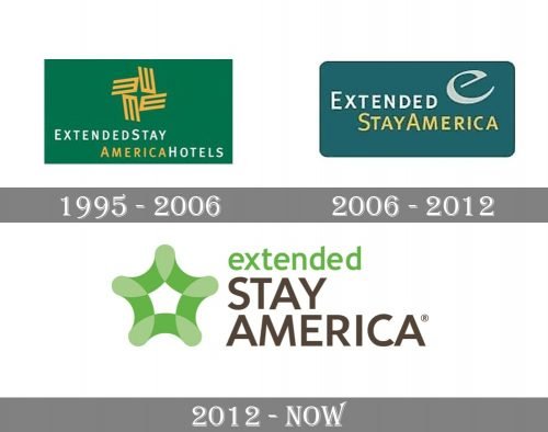
1995 – 2006

Originally, the logo of ESA was a green rectangular shape with the emblem put in the top and text section in the bottom. The emblem consisted of four elongated ‘E’ letters colored yellow and put side to side in the middle as a windmill. The blank space between them looked, as a result, as a 4-tip star.
The text included ‘ExtendedStay’ written one line, and ‘AmericaHotels’ below it. There were not gaps between the letters, and they were all white (except for ‘America’, which was yellow).
2006 – 2012

In 2006, the green background turned into dark blue. The wordmark now occupied the central plane. The design was similar, except ‘Stay’ moved to the second line, ‘Hotels’ was scrapped, and the whole second line became yellow. The emblem was a simple lowercase ‘e’ written in white in the top right corner.
2012 – Today
The Extended Stay America visual identity is based on a simple inscription and a bright color palette. The logo is composed of a wordmark and an emblem on its left.
The nameplate features two different styles and colors of the lettering — the upper part has “extended” in the lowercase sans-serif typeface with a diagonal cut of the letter tails, it is colored green.
The lower part “Stay America” is written in all capitals of the straight and neat sans-serif font in a dark chocolate color. It is a clean geometric inscription, which evokes a sense of reliability and confidence.
The Extended Stay America emblem is a stylized green star with rounded angles. Its smooth lines create a feeling of comfort and warmth.
The green and chocolate-brown color scheme of the Extended Stay America logo represents the brand that values energy and progress, as well as aims to create a cozy home away from home for its clients.


