Excedrin is a brand of a pain relief drug, which is composed of aspirin, paracetamol, and caffeine. The medicine is manufactured by Novartis since 2005 (before it was produced by Bristol-Myers Squibb).
Meaning and history
Excedrin is a medication that is designed to fight headaches, toothaches, and muscle pain. The drug is based on acetylsalicylic acid, paracetamol and caffeine, which are the main active ingredients and are excellent for treating all symptoms. Exedrin is available in the form of tablets with a certain concentration of active ingredients.
The mechanism of action of Exedrin is that it acts on the sources of pain, while relieving spasm and stopping inflammation, improving blood circulation in the affected area and preventing the formation of blood clots. At the same time it activates the body well, fighting fatigue and desire to sleep.
What is Excedrin?
Excedrin is the name of a painkilling medication that contains three different substances that have different properties, but together they are excellent for pain of different nature. These substances are Acetylsalicylic Acid or Aspirin, Caffeine and Paracetamol.
???? – 2007
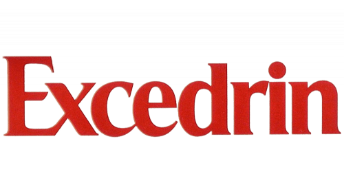
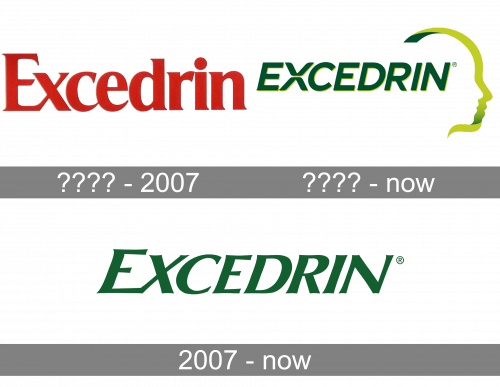
The first logo was simply the company’s name written in serif letters. The color was a dark hue of red.
???? – Today (International)
Some time into their history, they opted to have a separate international logo. It was also the company’s name, but written in green letters this time. They were also uppercase and were tilted. On their right, there was also a greenish-yellow silhouette of a head, styled as a ribbon.
2007 – Today (United States)
The Excedrin visual identity was redesigned in 2007 and gained a stylish and modern look. The brand’s wordmark is placed on a white background with a bright green underline, curving on its right.
The slightly italicized capital lettering of the wordmark is executed in a sharp geometric sans-serif typeface, where the ends of the letter-lines are a little extended and the angles are pointed.
The first “E” of the nameplate is enlarged, which creates a powerful and progressive feeling, making the logo look stronger and more confident.
The intense green of the lettering is a symbol of nature and its energy, as well and harmony and stability. For the brand, it means it’s the ability to help people with their health conditions.
Placed on a package, the Excedrin logo featured a bright bottom part, which is colored depending on the type of medicine. The brand also features a memorable and creative tagline “The pain stops. You don’t”, which is written in small green letters above the wordmark.
Font and Color
The uppercase lettering from the primary Excedrin logo is set in a sharp and elegant italicized typeface with flared ends of the bars. The closest fonts to the one, used in this insignia, are, probably, Charpentier Sans Pro 66 Demi Italique, or Zapf Humanist 601 Std Ultra Italic.
As for the color palette of the Excedrin visual identity, it is based on a deep shade of green, which looks serious and reliable, evoking a sense of trust and confidence in the medication, offered under this brand name.


