

![]() Estee Lauder Logo PNG
Estee Lauder Logo PNG
While the overall style of the Estee Lauder logo has remained pretty consistent through the years, there have been at least three subtle updates. You can notice them if you take a closer look at the different versions and compare them side by side.
Meaning and history
The roots of Estée Lauder Companies Inc. can be traced back to 1946. Today, it is one of the largest US companies specializing in the manufacturing and marketing of skincare, makeup, fragrance, and hair care products.
You can come across two old logotypes.
One of them is given in a simple sans looking very much like the logo of the brand itself. Here, the glyphs are made up of strokes of different widths. The name of the founder, Estee Lauder, is given in larger letters, while the word “Companies” is smaller. It is placed below. All the words are capitalized.
![]()
There is also a version featuring the Optima font. At first glance, it may look very much like the one described above, and yet, it is slightly more refined. You can notice elegant details, including the unusual ends and angles, as well as the difference in the widths of the strokes.
Current corporate symbol
At first glance, the Estee Lauder Companies logo as seen on the official website may look pretty similar to the old ones. And yet, you can notice it is far from being the same. To begin with, all the words are placed within a single line. The word “Companies” is of the same height as the writing “Estee Lauder.”
While you can notice that some of the bars and curves are wider than the others, the difference is not as obvious as in the previous logos. While the overall style is pretty simple, you can notice the playful and elegant curve at the end of the “R.”
![]()
Estee Lauder brand’s emblem
The logo used by the Estee Lauder brand itself is slightly different from the logo of Estee Lauder Companies.
To begin with, the type is by far simpler – it is a sans serif font without the decorative ends that can be seen on the older Estee Lauder Companies logo featuring the Optima font. In fact, it is more like another old corporate logo that is not used anymore. In spite of its minimalism, the wordmark has an elegant touch due to the varying widths of the bars and curves forming the glyphs.
Because of its simpler design, the logo is easier to reproduce.
Brands under Estee Lauder
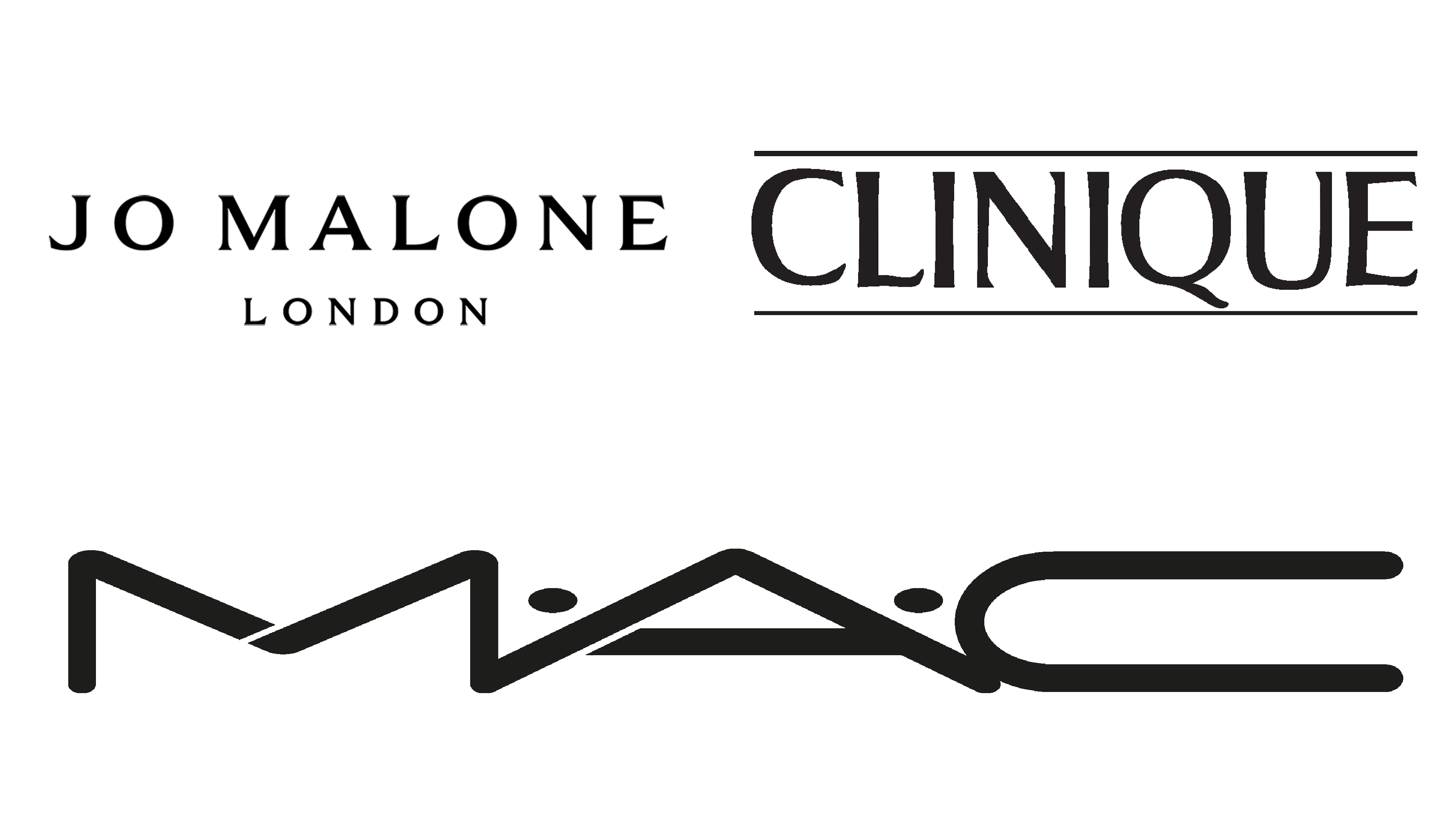
There are several cosmetic and personal care brands, owned by Estee Lauder. The most prominent include Clinique, Jo Malone London and MAC Cosmetics.
![]()
Clinique is an American brand, started in 1968 by Estee Lauder. They mostly sell safe, healthy skincare products that are extensively tested to have the least amount of acidic and harmful components. The logo is just the word ‘Clinique’, written in black, capitalized letters with a fluid, wavy serif font.
![]()
Jo Malone London is a British brand, founded in 1990. It’s mostly a producer of perfumes and similar scented products. Their logo is a big white rectangle with a black frame along its edges. In the middle, they placed the company’s name in two lines. Both of them used bold serif letters, although the second line with ‘London’ on it used smaller letters.
![]()
MAC Cosmetics is a Canadian producer of cosmetics, which mostly means makeup. The company was started in 1984 and bought by Estee Lauder in 1998. Their logo depicts the word ‘MAC’, composed of three capitalized, overly wide letters. They had straight lines with rounded tips and dots between the letters.
Colors
While you can come across an older version in dark blue, the current website features the Estee Lauder logo in black (the brand’s logo) or white (the corporate logo).


