Covergirl is a famous make-up brand from the USA. It was created in 1961 and became one of the most well-known American cosmetics brands across the world. Today the label is a part of Coty Group.
Meaning and history
The Covergirl logo is common for the cosmetics industry — it is text-based and executed in a black and white color palette.
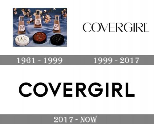
1961 – 1999

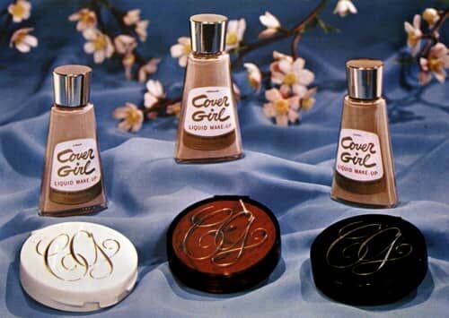
The original Covergirl logo was created in 1961 and could be seen on the first packaging of the brand’s cosmetics. The cosmetic label’s visual identity boasted two pets — the bold golden logotype, set in handwritten cursive and usually placed in two levels over the glass bottles with liquid products, and a fancy ornate monogram with elongated lines and curved, which was also executed in a gold color palette, and placed on powders cans with black, white or dark red background. It looked very feminine and chic, just perfect to reflect the spirit of the brand.
1999 – 2017

The redesign of 1999 completely changed the design approach of the company, making it minimalistic and laconic. It was a modern yet still very elegant uppercase logotype in a fancy sans-serif typeface with some bars thinner than others. The black letters had their contours extremely clean and perfectly balanced, which elevated the simplicity of the badge, making it something iconic and timeless. The badge stayed untouched for almost twenty years.
2017
The redesign of 2017 transformed the iconic elegant style of the brand’s inscription to a more modern and bold. The geometric sans-serif typeface of the Covergirl logotype is bright and confident, with its thick lines and straight cuts.
With the redesign, the brand decided to add its motto to the logo as the tagline. “I am what I make up” is written in the same style typeface as the nameplate, but with thinner lines and wider spacing.
The white letters of the logo are placed on a black background, which makes the traditional color scheme look sharper and more contemporary.
The Covergirl logo is timeless and classic, perfectly balanced text in a perfect monochrome. Nothing else needed here. It reflects the company’s power and authority, its influence in the world’s make up industry and its fundamental approach to style and design.


