Herbal Essences is a range of haircare products introduced by Procter & Gamble. It began in 1971 from a single shampoo called Clairol Herbal Essence Shampoo.
Meaning and history
The Herbal Essences brand appeared in the United States in the 1970s. The brand’s philosophy was based on the idea that hair care should bring not only benefits, but also pleasure. This idea was realized in Herbal Essences balms and shampoos, which have memorable exquisite fragrances and airy textures that form a surprisingly silky foam.
Herbal Essences is the world’s first hair care brand to partner with the Royal Botanic Gardens of Kew in London, a world authority on botany. Kew Gardens certifies the quality of botanical ingredients in Herbal Essences products.
Kew Gardens, located in West London, is the most biodiverse place on Earth, where more than 30 thousand different species of plants grow. Since 2003 Kew Gardens is a UNESCO World Heritage Site and has 260 years of expertise in botany and has been studying plants since the time of Charles Darwin.
What is Herbal Essences?
Herbal Essences is the name of a hair care products brand, which was established in 1971, and today is owned by the global Procter & Gamble company. The brand is specialized on the production of plant-based products, which are available in dozens of countries across the globe.
1978 – 1980s
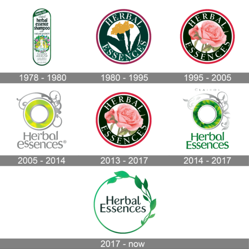
The old Herbal Essences logo featured the lettering “Clairol Herbal Essence” in dark green.
1980s – 1995
A roundel logo featuring various flowers and a serif type was used.
1995 – 2005, 2013 – 2017
The redesign of 1995 brought a very romantic and sophisticated badge to the brand. It was the same dark green circular frame with the white inscription, but in the middle of the emblem a different flower was drawn — a tender and very detailed rose in a smooth calm color. The red outline of the insignia changed its shade to a lighter and brighter one, which made the fine and feminine badge look stronger and more stable.
2005 – 2014
The logo showcased a light green and yellow ring with silver trim and the silver lettering “Herbal Essences.”
2014 – 2017
In 2013 the brand comes back to its logo version, created in 1995 — the pink rose in a dark green circular frame with a white and red outline. The white capitalized inscription in a classy bold serif tour face was written around the green part of the badge, looking professional and adding a sense of reliability and expertise to the brand.
2017
The thick ring was replaced by a simpler, thin one decorated with green leaves. The name of the brand could be seen inside.
Font and Color
The smooth and elegant title case lettering from the primary logo of the Herbal Essences brand is set in a fancy and playful sans-serif typeface with softened ends of the bars. The closest fonts to the one, used in this insignia, are, probably, Ethna Light, or Sandena Medium, with some significant modifications of the characters’ contours.
As for the color palette of the Herbal Essences visual identity, it is based in a deep and calm shade of green, the color of growth and nature, and a smooth yellowish beige, used for the background and creating even a more tender look for all the elements.


