The logo of Enkei Corporation is reminiscent of its core product, custom aftermarket wheels.
Meaning and history
Enkei was founded in 1950 in Japan as the Enshu Keigokin Joint Stock Company, which can be translated into English as Enshu Light Alloys, hence the current name of the company, is derived from the first letters of Enshu Keigokin.
Since its founding, ENKEI began its developments in the light alloy industry as a material for the production of rims for automobile and motorcycle sports.Initially, engineers mastered the production of parts for airplanes and other aircraft, but shortly knowledge of aircraft engineering allowed a timely response to the growing market and mastered the production of engine blocks and other automotive components for cars and motorcycles.
Some time later, the fast-growing firm decided to focus on the production of aluminum wheels for automobiles, one of the first in the world. In 1967, ENKEI entered the global automotive wheel market. A factory was officially established to produce rims for export. This allowed ENKEI rims to become more accessible not only to sports teams but also to a wide range of car owners. Already in 1969 a specialized division was launched, producing products for export. Primarily in the United States. In 1985, the company had its manufacturing plant in the U.S. and then opened plants in Southeast Asia and China.
Today Enkei is a global corporation with approximately 4,5 thousand employees, and high-quality products distributed all over the globe.
What is Enkei?
Enkei is the name of a Japanese auto-making company, which was established in 1950 and is mostly known for its motorcycles. Apart from motorcycles, the company manufactures passenger vehicles, which are mainly sold in Japan and Asian countries.
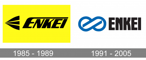
1991 – 2001
Enkei is a Japan-based corporation specializing in manufacturing motorcycle and passenger car wheels for both motorsport and street use. It was established in 1950.
The pictorial part of the Enkei logo consists of a modified infinity symbol. On the one hand, it represents the road. From the other, it symbolizes the wheels. The symbol is white with thick dark blue trim.
To the left, the name of the brand can be seen. It is given in an artistic sans serif type. The letters are pretty heavy. Probably the most distinctive feature is the way the diagonal lines on the “N” and “K” have been replaced by the curves.
1985 – 1989
Earlier, the company used a completely different emblem. The old Enkei logo was dominated by yellow and black. It featured the word “Enkei” in a heavy type. The widths of the lines by which the glyphs were formed varied dramatically. The initial “E” was an especially distinctive letter. Its end stretched above all the other characters. The “E” symbolized the road.
To the left of the wordmark, there was an emblem, which was reminiscent of both the road and the letter “E.”
Font and Color
The heavy stylish uppercase lettering from the primary Enkei logo is set in a custom and elegant sans-serif typeface, which looks very sophisticated despite the thickness of the bars and heaviness of the characters. The closest fonts to the one, used in this insignia, are, probably, Winter Garden JNL, or Robuck Regular, but with some visible modifications of the letters’ contours.
As for the color palette of the Enkei visual identity, it is based on a combination of black and blue, with a plain white background, which adds freshness and lightness to the heavy elements and intense shades. The color scheme stands for stability and professionalism, evoking a sense of confidence and reliability.


