The Edmonton Elks have played in the Canadian Football League since 1949 and have won 14 trophies in that time, and the Elks also hold the record for the most consecutive playoff appearances of any team in the North American sports leagues, as they have made the playoffs 34 times in a row. However, the club didn’t get its current name until 2021, and since its inception, the Elks have been known as the Edmonton Eskimos. It’s been a major participant in the Canadian Football League since the beginning of the 1950s, although the team itself is much older. Their first matches were played in the 1930s.
Meaning and History
Edmonton Elks is a second incarnation of the older Edmonton Eskimos team, which was started in the 30s. The team entered the professional league in 1958, as soon as it was established. In it, Elks represent Edmonton, which is a city in Alberta province. That puts them in the Western Division of the CFL.
What is Edmonton Elks?
Edmonton Elks are a professional Canadian football team from Alberta. The club has been active since the 1930s and plays in the CFL since the 50s.
1930 – 1970
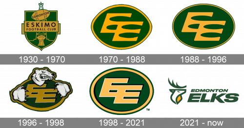
The first proper emblem Eskimos used was a green shield with the yellow rims. The center was occupied by a yellow plaque that contained the club’s name, made in black sans-serif letters (as ‘Eskimos Football Club’). There were several more elements on the shield itself, bottom to top: a stack of wheat, an oil derrick (Edmonton being Canada’s oil capital), a football with the word ‘Edmonton’ on it.
1970 – 1988
The next design uses the same color scheme, but it’s now a shape of a football with two ‘E’ letters inside. They don’t have boundaries, and one continues into the other. Basically, the two lower bars of the first ‘E’ are also the two upper bars of the other. The font is smooth, but very rectangular.
1988 – 1996
By 1988, the base was rounded to a normal oval, instead of the football. The rim also changed: the yellow bit was now much slimmer than before.
1996 – 1998
This season’s emblem uses blockier, more linear letters. The yellow rims became fatter again, and there was also a notable addition of a polar bear and its two paws on the periphery. That made the emblem looked as if it’s gripped by the predator.
1998 – 2021
This is the same emblem from before, but without the bear parts around it.
2021 – today
In 2021, the name Elks was adopted. On this new emblem, it was plastered in the bottom, using dark green letters of a sans-serif font. Right above, they drew an elk’s head. It was largely a number of thick, dark-green lines that constituted a general shape of the animal’s head + the horns. They also gave it a determined look in its one eye.


