Eastern League, a prominent minor league baseball organization, is notably under the ownership of Minor League Baseball. Its inception dates back to the early 20th century, establishing itself as a cornerstone in developing baseball talent. The league operates primarily in the northeastern United States, encompassing states like Pennsylvania, New York, New Jersey, and others. Its reach and influence in these regions are significant, contributing not only to the sports culture but also to local economies and community engagement.
Meaning and history
The Eastern League was founded in 1923, born out of a rich history of baseball and sportsmanship. Its creation was a pivotal moment in minor league baseball, setting a standard for regional baseball leagues. Over the years, the Eastern League has been a crucible for talent, seeing many of its players ascend to major league fame. These achievements highlight the league’s commitment to nurturing and developing skilled athletes. Notable players who have graced its fields include legends such as Jim Rice and Wade Boggs. Today, the Eastern League stands as a significant figure in minor league baseball, continuously evolving and adapting to the changing landscapes of sports, maintaining its reputation for excellence and its vital role in the development of professional baseball.
What is Eastern League?
It’s a distinguished minor league baseball organization, playing a pivotal role in nurturing future major league talents. With its deep roots in the northeastern United States, the league exemplifies the spirit of regional baseball, blending sportsmanship with community engagement.
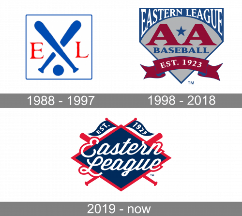
1988 – 1997
The earliest Eastern League logo (1988-1997) depicted blue crisscrossed baseball bats with the letters “E” and “L” on both sides.
1998 – 2018

For some 20 years, they’ve used this logo instead. It depicts a grey shield with arched blue space on the top, as well as edges of the same color. The grey space contains two big, red ‘A’ letters, as well as ‘Baseball’ written in blue right beneath them. The blue bit instead said ‘Eastern League’ in white serif letters. There was also an image of a red ribbon near the bottom of the logo, which said ‘est. 1923’ in white.
2019 – Today
There’s certainly a pirate theme inspiration behind the Eastern League logo. For one, the crisscrossed baseball bats are reminiscent of the legendary flag (Jolly Roger). Also, there’re actually two flags on the top of the logo, which make the pirate theme even more prominent. Below the flags, there’s the lettering “Eastern League” in a white script. It is placed over a navy blue rhombus “standing” on one of its obtuse angles. This emblem was introduced in 2018.


