Meaning and history
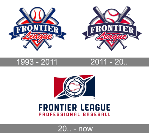
The Frontier League logo echoes many recurrent motives of contemporary professional baseball logos. There’re two crisscrossed bats and a baseball, as well as the color scheme including red, blue, and white. On the background, there’s an outline of a baseball field.
What is Frontier League?
Frontier League is an American sports organization which has been holding baseball competitions since 1993. It unites the teams in Northwestern and Midwestern United States as well as Eastern Canada. It’s the oldest running league in US. Typically, the competitions run from May to September. The teams play a 96-game regular season.
1993 – 2011
The first brand logotype depicted a line with the word ‘Frontier’. It had a bold serif typeface with uppercase letters. Below it, there was the red ‘League’ word in a handwritten script. Behind the inscriptions, we can see two bats crossing each other. Between them, a ball with two red patterns was showing off. The background for it all was a triangle pointed down.
2011 – 2000s
However, due to the lettering ‘Frontier” (on a blue banner) and “League” (red script), you’ll never have a doubt as to what organization the logo belongs to. To the 2011 version of the brand logo, they added a red background. Also, they turned the ball to the other side.
Today
The updated logo has the same color palette, preserving the visual identity of the league as well as making an association with the American flag. In fact, it had a flag that is split into red and blue diagonally serving as the base for a round stylized emblem that had a baseball ball in the center. At the bottom, the bottom the logo had a bold, two-line inscription. The first line had “Frontier League” printed in a dark blue, geometric font that resembled Refinery 35 Bold or Bourton Base. The lower line used the same font, only featured smaller size letters of red color. The logo looked solid, confident, and patriotic.
Font and color
The name was written in two different fonts. For the ‘Frontier’ word they used a bold white typeface with prominent serifs and large uppercase characters. The ‘League’, located below, had a fat red handwritten script. They also added a double red and white contour to the word.
The logotype itself used a palette consisting of blue, gray, white and red colors. For the triangle on the background, they made a double blue and gray outline. There were also two zones at the bottom and top, colored white. The inner part of the triangle was colored red. The ball had a similar blue and gray outline with white inside, where they placed two red patterns. For the bats and line with the name the brand designers decided to use gray, blue and white shades.


