e.Go is a distinctive brand in the automotive industry, focusing on creating electric vehicles. Established in Aachen, Germany, e.Go aims to produce affordable and practical electric cars for everyday use. The company’s vision is rooted in sustainability and innovation, making electric mobility accessible to a broader audience. With a commitment to environmental responsibility, e.Go designs vehicles that offer a blend of efficiency, affordability, and urban-friendly features. Their creation is a response to the growing demand for eco-friendly transportation solutions.
Meaning and history
e.Go Mobile AG, founded by Professor Günther Schuh, emerged in Aachen, Germany, as a trailblazer in electric vehicle (EV) production. Its inception in 2015 marked a pivotal shift towards sustainable, urban mobility solutions. Schuh, leveraging expertise from his involvement in the StreetScooter project, aimed to revolutionize the EV market with affordable, practical options. e.Go’s debut model, the e.Go Life, launched in 2019, embodied this vision, offering a compact, efficient alternative to traditional vehicles. Despite initial success, e.Go faced financial challenges, leading to a 2020 bankruptcy filing. However, the company resiliently restructured, securing support from investors like ND Industrial Investments and continuing its mission to democratize electric mobility. Its journey reflects the dynamic, often challenging landscape of the burgeoning EV sector, showcasing innovation, adaptability, and a steadfast commitment to green transportation.
What is e.Go?
e.Go Mobile AG stands out as an innovative force in the electric vehicle industry, born in the heart of Aachen, Germany. Spearheaded by the vision of Prof. Dr. Günther Schuh, the company focuses on crafting affordable, urban-centric electric cars, blending modern technology with a commitment to sustainable mobility. Their approach marks a significant stride in making electric transportation accessible and practical for everyday users.
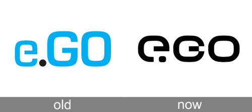
Old
The logo captivates with its bright blue hue, imparting a vibrant and energetic aura. Composed of the letters “e.GO” in a rounded sans-serif font, the design exudes a friendly and approachable feel. A single black dot punctuates the logo, perhaps a nod to the company’s focus on simplicity and efficiency. The lowercased “e” and uppercase “G” and “O” balance informality with presence, reflecting a company at the intersection of casual appeal and serious ambition. Its clean lines and lack of embellishment suggest a brand dedicated to clarity and functionality.
Today
Transitioning from a vivid blue to a stark black, this iteration of the logo adopts a more formal, powerful stance. The black tone conveys sophistication and modernity, possibly reflecting a shift towards a more premium or serious brand positioning. The playful dot remains, a consistent element that adds a touch of uniqueness to the otherwise straightforward typography. This monochromatic version exudes a classic feel, suggesting reliability and strength, and could be a strategic move to appeal to a wider, perhaps more conservative audience.


