Hyundai, or Hyundai Motor Company, is the name of a famous Korean automaker, which was established in 1967 and by today has become one of the largest Asian automobile manufacturers. Apart from affordable and luxury cars, Hyundai also produces engines and vehicle parts, which are used by many other brands across the globe.
Meaning and history
One of the most curious auto badges is the one Hyundai has adopted at the beginning of the 1990s. At the first sight, the brand’s logo is a simple letter enclosed intro an oval frame, but the idea behind the emblem was a stylized drawing of two people shaking hands. The silhouettes of the customer and seller, showing their satisfaction with the deal, have made up the iconic “H”. Though before the logo we all know today, the company has changed several designs.
What is Hyundai?
Hyundai is one of the largest automating companies in South Korea, which was established in 1967, and today successfully operates not only in the Asian market but all our the globe. Apart from mass-market models, the portfolio of the company includes luxury cars, commercial vehicles, electro mobiles, and engines.
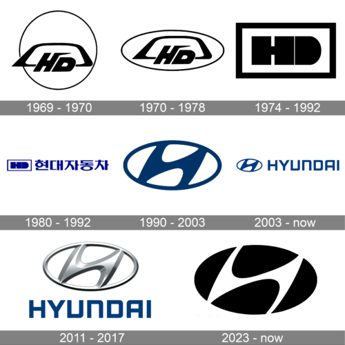
1969 – 1970
The emblem, created for the Korean brand in 1969 featured a monochrome composition where the “HD” monogram in a custom typeface was placed on a trapezoid with its upper corners rounded, and bottom ones — sharpened. The Hyundai “H” had its right vertical bar elongated and bent to the right in its upper part, with the end of the line pointed. The image was placed on a white background and featured a thin black circular frame.
1970 – 1978
The abstract car contour with the “HD” lettering was slightly refined in 1970. Both elements became smaller and the circular frame was switched to a horizontally stretched oval, which will come back to the Hyundai visual identity with the modern emblem, in 1990.
1974 – 1992
The logo displayed in the image is a bold, monochromatic design featuring the initials “HD” in a stark black and white color scheme. The letters are encased within a double-framed rectangular border that adds depth and emphasis to the design. The “H” and “D” are styled with a modern, geometric approach, sharing a common vertical line that unites the two characters, symbolizing connection and cohesion. The “D” is uniquely designed with a semicircular form that seamlessly aligns with the straight lines of the “H,” suggesting a fusion of different elements into a harmonious whole.
1980 – 1992
In 1980 Hyundai completely changed the concept of its visual identity, creating a new logo and adopting a fresh and intense color palette. The smooth lines of the initial version were switched to straight geometry, and now the badge featured a horizontally placed rectangular with the bold blue “HD” lettering on the left and the name of the company in Korean placed on the right from the monogram. The blue and white color scheme made the logo more delightful and recognizable, while the straight shapes represented professionalism and reliability.
1990 – 2003
The first version of the iconic Hyundai logo we all know today appeared in 1990 and is still used by the brand. The company decided to take elements from all previous designs and the combination worked just fine. The new logo featured an oval shape of the frame and a slanted bold letter “H” enclosed into it. The color palette remained the same — blue and white, but the shade of blue became deeper and darker.
2003 – Today
In 2003 the smooth elegant emblem of Hyundai gets accompanied by a modern and stylish logotype, which is placed on its right and executed in the uppercase of a custom sans-serif typeface with clean lines and half of the angles rounded. The “N” in the wordmark is the only letter, written in the lowercase column but features the same size as the neighboring capitals.
2011 – 2017
In 2011 Hyundai decided to go three-dimensional and started using a voluminous silver emblem instead of the flat blue one. The lines remained untouched, as well as the logotype, which was still placed in the right from the symbol, but due to the use of gradient glossy metallic shade, the whole image looks more airy and fresh. Though this badge stayed in official use for only six years.
2023 – now
The logo depicted in the image is a sleek and modern emblem, consisting of a stylized, abstract shape that could be perceived as a letter or symbol. It is designed with a series of bold, black curves that interlock with negative white space to form a harmonious and balanced figure within a circular outline. The interplay of the curved elements and the contrast between black and white create a dynamic and fluid motion, giving the impression of perpetual movement and innovation. This logo’s simple yet powerful design easily represent a company that prides itself on modernity, sophistication, and a forward-thinking approach to its industry.
Font and color
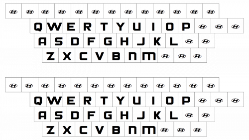
The Hyundai logotype is set in a mixed-case of a futuristic and bold sans-serif typeface, which is very similar to such fonts as Lustra Semi Bold and Bank Sans SemiCond Bold. The letters have the angles on one side sharpened, and on the other — softened, which created a unique mood and evokes a sense of motion and speed.
The color palette of the South Korean automaker is based on an intense shade of blue, which looks sleek and professional, representing the confidence and excellence of the company and its expertise in the industry.
Why did Hyundai change its logo?
Hyundai dramatically changed its logo at the beginning of the 1990s, with the bold geometric lettering in Japanese, following the simple emblem in a rectangular frame, replaced by a sleek and elegant slanted “H” inscribed into a trenches oval.
What is the Hyundai symbol supposed to be?
The Hyundai symbol is a stylized slanted letter “H” with softened contours and a slight inclination of the bars. The letter is enclosed into a horizontally-oriented oval, with the vertical bars merging with the contours of the frame. The badge of the automaker is usually depicted in dark blue.
What’s the difference between a Honda and a Hyundai symbol?
There is a significant difference between the logos of two Asian automakers, Honda and Hyundai. The only similarity between the two badges is the capital letter “H” as the central element. In the Honda badge, the “H” is written straight and enclosed into a trapezoidal frame with rounded angles, while the Hyundai emblem depicts an italicized elegant “H” inscribed into an oval.


