Ducati is one of the world’s most famous motorbike manufacturing brands, which was established in 1926 in Italy. The brand is managed by Lamborghini, which is owned by German Volkswagen. Ducati is highly recognizable and respected across the globe for an immaculate design and high quality of its motorcycles.
Meaning and history
The brand, named after its founders, the Ducati family, is one of the brightest representatives of pure Italian design and aesthetics. Starting with their illustrious motorbikes and finishing with advertising prospects of the early company’s years — everything about this brand has a wow-effect.
1927 – 1935
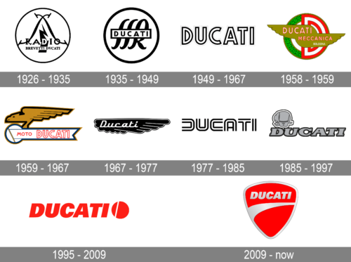
The first Ducati logo was designed based on the original company’s profile — radio production. The logo was composed of a circle with two crossed wires depicted on two sides of the electrical lighting. The wordmark “Radio Brevetti Dvcati” (with “V” replacing “U”) was written in the bottom part of the circle. The logo was executed in a monochrome palette.
1935 – 1940
The brand gets a new logo design in 1935. Now it is composed of a bolder sitcom with cursive letters “SSR”, standing for Societá Scientifica Radio, and the rectangular placed horizontally with the “Ducati” wordmark in all caps on it. The color palette remains unchanged.
1940 – 1955
For the next 15 years, the brand uses different versions of the text-based logos. One of them features a straight-lines sans-serif font, while the other — handwritten-styles bold lines of all the lowercase lettering.
1956 – 1959
The company splits into two branches in 1953, and the new logo is created. It features a bright green and red circle with an enlarged letter “D” on the right side and a laurel wreath on the left. Above the circle, two wings with the “Ducati Meccanica Bologna” wordmark is located.
The same year one more logo was designed — a shield with a Ducati motorcycle pictured on its top, a checkered ornament and a wordmark in a traditional typeface. This logo was executed in a monochrome color scheme.
1959 – 1967
The Ducati logo from 1959 features a profile of the eagle, carrying a “Ducati Moto” wordmark-flag. The bird symbolizes freedom and speed. It is a powerful and strong image, showing the progressive approach of the company.
1967 – 1975
The Ducati visual identity from 1967 was composed of a black wing in a white outline with italic lettering of the wordmark on it. It was an elegant logo, smooth and fine one.
1975 – 1985
Giorgetto Giugiaro designs unique lettering for the new Ducati logo in 1975. It is a contemporary and powerful design, which is simple and masculine. The use of the parallel lines makes it look layered and bold.
1985 – 1997
The brand has a funny and playful period of its visual design from 1985 to 1997. The traditional typeface of the wordmark is now accompanied by a little image of an elephant on its top left.
In 1993 the elephant is removed from the logo, but the shadowed bold lettering remains, just the color of the outline is switched to a lighter tone.
1997 – 2009
The logo from 1997 is composed of a bold red wordmark, executed in a Universe Italic font and a black emblem on its left, depicting a circle with a white vertical line, which resembles a coffee bean when it is right to part — a stylized letter “D”. It was a very bright and modern logo, minimalist in style, but remarkable.
2009 – Today
The redesign of 2009 brought Ducati a new logo, which is composed of a shield with a curve line, which is a graphical representation of the earliest Ducati wing, and the wordmark executed in a strong and confident typeface. The red and white color scheme of the Ducati logo is a symbol of the passion and energy of the powerful and influential brand.


