The current Dremel logo looks cleaner and more modern than its pretty cluttered predecessors.
Meaning and history
Dremel begins its history in 1932 when American engineer Albert J. Dremel thought about inventions in the field of hand tools.The first models the new company produced were high-speed rotary hand tools. It was with them that the epic production of such tools began, under the name of Dremel.
In 1993, the Dremel brand was acquired by the well-known Bosch company. Products are manufactured by the toolmaking division of that company, Robert Bosch Tool Corporation. But the company’s headquarters for Dremel brand tools is located in Mount Prospect in Illinois, USA. The European division is located in Breda, in the Netherlands.
Today Dremel offers customers a huge range of tools. Heat guns and screwdrivers, grinders, and routers can be used today in a variety of industries.In addition to producing more than a hundred accessories that make tools versatile, Dremel also makes stationary tools: drills, glue guns, soldering irons, jigsaws, and more.
The wide range of products is used for a wide variety of applications: construction, jewelry, auto repair shops, etc. Dremel is known for its innovation, functionality, reliability, and quality.
What is Dremel?
Dremel is the name of an American manufacturer of power tools, which was established in Illinois in 1932, and by today has grown into one of the world’s leading companies in its segment. Dremel offers such products as rotary tools, hot glue guns, scroll saws, and many others.
2001 – 2003
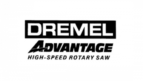
The 2001 logo consists of several layers. Firstly, there’s a white ‘Dremel’ wordmark put inside a black rectangle. On the line below it, there’s a black word ‘Advantage’. It uses a font similar to ‘Dremel’, but bolder and tilted. There’s also a lightning bolt instead of a central bar in ‘A’. Lastly, ‘high-speed rotary saw’ is written in the very bottom. It’s also black, but the letters are much plainer.
2003 – Today
Dremel is an American brand of power tools founded in 1932 and based in Mt. Prospect, Illinois, the US. It is known primarily for its rotary tools. Dremel Europe, which is a manufacturer of power tools, accessories, and attachments, specializes in home improvement and hobby applications.
The logo of the US brand features a bold, heavy type. Its glyphs, which look somewhat broader than average, seem to represent the company’s core promise – reliability and efficiency of its products. The design forces behind the brand opted for a dark and saturated shade of blue and placed it over the white background. This approach creates enough contrast to preserve the legibility of the logo.
In what way is the Dremel Europe logo different? To begin with, the designers who worked on the logo added the tagline “Big on detail” below the name of the brand. Also, they reversed the color scheme: here, the writing in white is housed inside a dark blue rectangle.
1932 – 1935
You can come across a red-dominated roundel version of the emblem. In the center, there is the word “Dremel” in black over the white background. Above and below, there are two identical red fields housing the writing “Since” and “1932” respectively. Three black vertical lines go across both the fields. The design is encircled by the writing “Celebrating 75 years of trust and quality.” This implies that this design was introduced in 2007-2008 as an anniversary emblem.
The anniversary emblem was inspired by a historic Dremel logo seen on old advertisements and products. The historic logo also featured the word “Dremel” inside a circle and the familiar vertical lines. In some cases, the field behind the wordmark was filled with red, too.
Font and Color
The stable and clean uppercase lettering from the primary badge of Dremel is set in a modern geometric sans-serif typeface, which looks very strict and minimalistic. The closest fonts to the one, used in this insignia, are, probably, Eurostile MN Extended Bold, or Unison Pro Bold, with some minor modifications of the contours.
As for the color palette of the Dremel visual identity, it is based on a calm and deep shade of blue, a color of confidence and reliability, which shows the company as a professional, stable, and responsible one. Blue is also the color of high quality and trust, which perfectly represents the main values of the American manufacturer.


