

![]() Beats by Dre Logo PNG
Beats by Dre Logo PNG
Beats by Dr Dre is a brand of audio products, created in 2006 in California, USA by Jimmie Iovine and Dr Dre, a world-famous rap star. In 2014 the brand was acquired by Apple. The company is primarily focused on production of headphones and speakers.
Meaning and history
The brand’s name comes from the music sphere and means the main accent in music rhythm, the beat. Beats by Dr Dre is a brand about the music: its name, its design and, most importantly, a quality of the sound in its products.
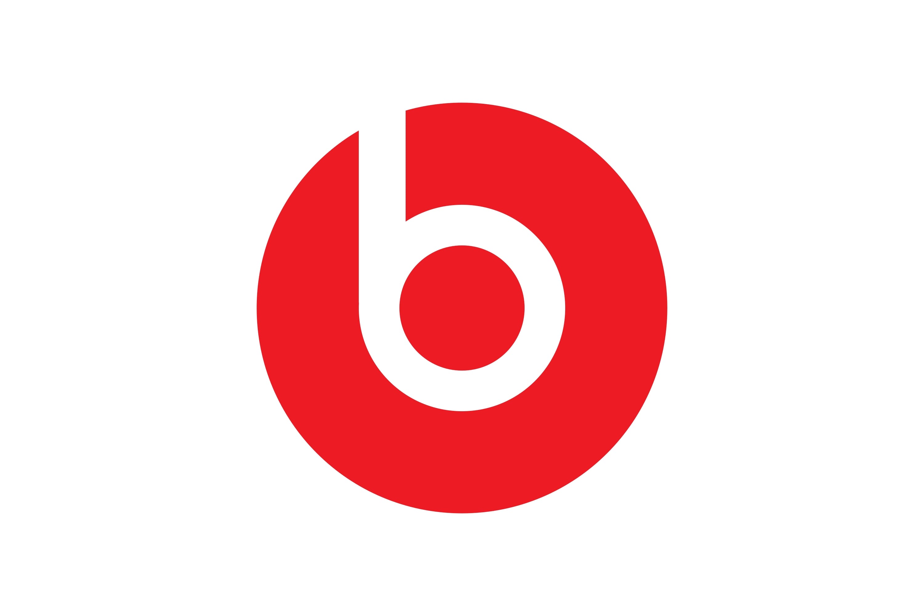
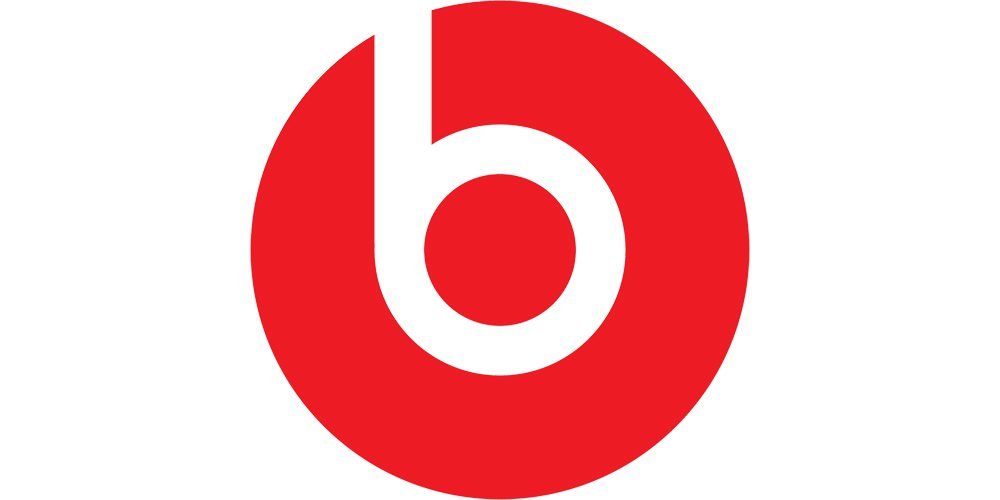
The Beats by Dre logo is bright, fresh and creative. Its main emblem is well-known all around the globe, despite the fact it resembles the logo of one of the German cities.
The Beats by Dre logo consists of two parts — an iconic image and a soft rounded wordmark. The wordmark is executed in smooth lowercase sans serif font. The same typeface is used for the emblem.
The emblem is a graphical representation of the brand’s signifier, the letter “b”, executed in white color. The design is stylish and sleek. The icon adds a dynamic element to the logo and it doesn’t only symbolize the brand’s name, but also repeats the shape of the headphones.
What is Beats?
Beats is an internationally-recognized manufacturer of headphones and consumer audio items, which was established in 2006 by the famous rap musician Dr.Dre. Today the portable speakers and headphones of the brand are sold all over the globe and are considered to be one of the most popular products in the segment.
Symbol
The Beats logo is very simple. However, it is just another example of the effectiveness of the minimalistic approach to logo design. It is a red circle on a black background with a lowercase letter ‘b’ inside, which is as if cut out of it. The combination of black and red presents a mix of excellence, prestige, power, passion, energy, and excitement.
Font and Color
The stylish lowercase lettering from the primary Beats by Dr. Dre badge is set in a modern sans-serif typeface with rounded shapes of the characters and clean contours. The closest fonts to the one, used in this insignia, are, probably, Harry Plain and Yaro Rg Thin but with some modifications.
As for the color palette of the Beats by Dr. Dre visual identity, it is based on the combination of red, white, and gray, an elegant and powerful tricolor, which looks confident and powerful, making up a statement, and reflecting the professionalism and strength of the company.


