Walkman is a brand of legendary portable music players, designed by Sony. Walkman sold over 200 million units since its launch in 1979 and until the its production was discontinued in 2009.
Meaning and history
The first Sony cassette players went on sale on July 1, 1979. A few months later, co-founder Masaru Ibuka wanted to see a more convenient and portable record player that could be taken on the road, for example on an airplane. So corporate designer Norio Oga created a prototype of a compact-sized cassette record player.
Over 400 million Walkman players were sold worldwide, of which 200 million were cassette versions. The range of cassette pocket players proved so popular that they were discontinued only in 2010.
The manufacturer of mobile phones Sony Ericsson produced a series of phones under the Walkman brand. In 2011, Sony Ericsson released its latest Walkman phone, the Sony Ericsson Live with Walkman. In the same year, Ericsson was taken over by Sony, and in 2012 Walkman became an application for Xperia smartphones, starting with the Xperia S smartphone. In March 2015, Sony dropped the Walkman brand from its branded smartphones, renaming it Music.
What is Walkman?
Walkman is an iconic brand of portable music players, established by Sonyat the end of the 1970s. Today Walkman is not just a brand, but also a generic name for portable audio devices, regardless of manufacturer. The products of the global portable players’ pioneer are sold all over the globe.
1979 – 1981

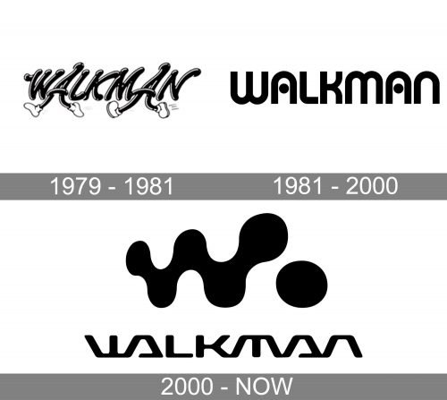
The very first logo for Walkman was very friendly and welcoming. Looking more like a caricature than insignia, it was composed of a hand-written wordmark with both letters “A” stylized as walking legs. The monochrome lettering was executed in a smooth rounded font with the thick lines of the letters and emboldened ends. Near the right white shoes of both “A”s there were thin horizontal lines, symbolizing motion and speed, and this not only represented the “walking” style of the logo, but also a progressive approach of the growing and developing brand.
1981 – 2000

The redesign of 1981 brought a more professional and modern look to the Walkman visual identity. Now the black logotype set on a white background was executed in a stylish custom sans-serif typeface with rounded angles, arched contours of both letters “Al and solid black dots replacing their horizontal bars.
2000 – Today
The brand’s name reflects an opportunity of listening to the favorite music while walking. It was a revolution in the industry.
The Walkman logo is unique and iconic. It is one of the most recognizable brand emblems in the world.
The nameplate in custom typeface is symmetric and futuristic, with straight lines, and is perfectly balanced by a blot-style emblem of the letter “W” with a dot.
Font and Color
The Walkman logo was created by Japanese designer Hiroshige Fukuhara, he also drawn the famous logotype, and Mouhammad Alnajjar created a typeface called “Walkman”, which perfectly replicated the original drawings.


