Dole is the name of an agricultural company, established in 1951 in the USA. The corporation is considered to be the world’s biggest manufacturer and distributor of fruits and vegetables and operates in almost 100 countries across the globe.
Meaning and history
Dole Is the most recognizable fresh produce brand in the United States, which operates worldwide. This American agricultural multinational corporation is headquartered in Westlake Village, California. The company is the largest producer of fruits and vegetables in the world. It employs more than 70 thousand employees.
Their most significant products hold leading positions in their categories and regions. Their business operates through several interaction and customer-focused brands, the most notable of which is their iconic Dole brand.
Dole sells foods such as bananas, pineapples, grapes, strawberries, and salads. Apart from fresh fruits, Dole supplies selected quality canned fruits in all formats as well as natural juices 365 days a year.
The company’s pride, Tropical Gold pineapples are the best choice on the international market because they are grown under the Philippine sun on fertile volcanic soil, without added sugar they have an intense taste, unique crispness, and natural golden color.
What is Dole?
Dole is the world’s leading producer and distributor of fresh fruits and vegetables. Dole offers more than 300 products grown and sourced both locally and internationally from more than 30 countries in various regions, which are distributed and sold in more than 80 countries worldwide.
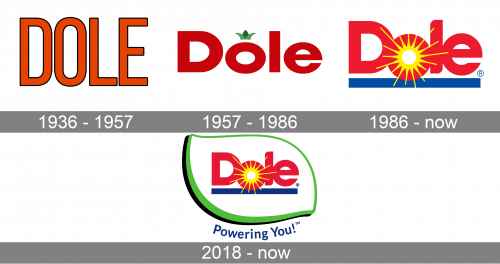
1936 – 1957
The logo, used by Dole in the 1930s—1950s featured a super simple composition with just the uppercase lettering on the badge. It was a narrowed sans-serif inscription with tall letters, featuring clean contours and neat lines. The characters were set in solid orange and outlined in black for better visibility on various backgrounds.
1957 – 1986
 The Dole visual identity was always based on red bold lettering of the nameplate. The original version of 1957 was composed of a wordmark and a green crown above the letter “O”, resembling a pineapple. The logo stayed with the brand for almost thirty years.
1986 – Today

The logo we all know today was designed in 1986. The red lettering was modernized into a more smooth sans-serif typeface, where all the letters were placed close to each other, with no space left. The blue underline was thick and straight. The most significant detail of the Dole logo from 1986 is a yellow abstract image of the sun, which was placed in the letter “O” and spread on “D” and “L”.
The logo, created in 1986 by Landor Associates, was slightly modified in 2018. The green leaf-shape frame was added to the wordmark and a blue inscription of the tagline was placed under the emblem.
2018 – Today
“Powering You!” In a rounded sans-serif font balanced the blue underline of the wordmark and says a lot about the company’s profile and values.

Font and color
The bold stylized lettering from the official Dole logo is set in a smooth sans-serif typeface with elegant lines and playful tails of the bars. This custom typeface, used in the Dole insignia, is based on many similar massive geometric fonts, such as example, Yaro RG Black or Gooher Black.
As for the color palette of the Dole visual identity, it is bright and intense, based on the combination of red, blue, yellow, and green, a scheme, which shows the whole assortment of the company’s products and evokes a sense of freshness and summer mood.


