As Morrisons has almost 500 superstores across Great Britain, its logo is well-known in the country. It has been redesigned several times for the last six decades to keep up with the time and to attract customers.
Meaning and history
When William Morrison, the founder of the company which is now known as Wm Morrison Supermarkets Plc, opened his first store in 1899 he sold eggs, milk and butter. Today the company is a supermarket giant, the fourth largest and the third oldest in the UK.
What are Morrisons?
Morrisons is the name of one of the top 5 supermarket chains in the UK, which was established at the end of the 19th century. Today the company has almost 500 locations across the country, offering its customers not only foods and beverages, but also clothing, homeware, books, and petrol.
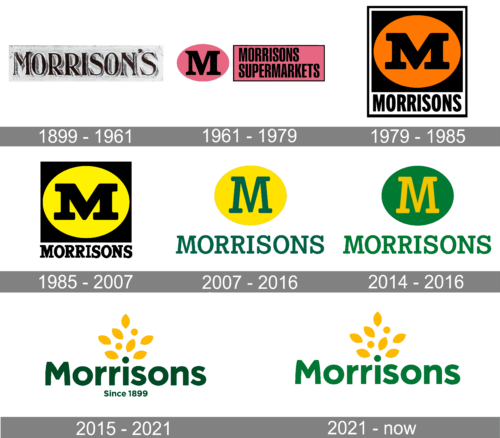
1899 – 1961
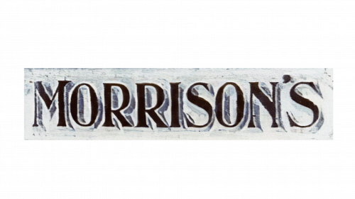
The original badge was designed for Morrisons in 1899 and stayed with the brand for more than sixty years, which already says a lot about the company’s stability and professionalism. It was a narrowed uppercase lettering in a fancy and classy serif font with the black letters shadowed and placed against a white background. The first letter of the wordmark was a bit enlarged compared to other characters, and this added a tiny unique feature to the composition.
1961 – 1979
The first Morrisons supermarket logo appeared in 1961 when the first supermarket was opened. It was a pink oval with the capital letter “M” in black paired with the wordmark “Morrisons Supermarkets” in all caps against a pink rectangle with black boarders. The logo became iconic and lasted over 40 years, having undergone some slight alterations.
1979 – 1985
The first modification was in 1979. The oval with the letter “M” was placed inside a rectangle with a black background. The lettering “Morrisons” was underneath against a white background. The colour palette included black, yellow and white. Yellow was incorporated to make the emblem look friendlier and fresh.
1985 – 2007
The revamp of 1985 introduced two subtle changes ‒ a lighter shade of yellow and the serif typeface for “Morrisons”.
2007 – 2016
Time passed, and Morrisons needed a softer and more modern brand image, especially as its geographical spread had expanded. So in 2007 they substituted the existing brand identity with a new one, made by the global design giant Landor Associates. It retained the traditional “M” symbol, the oval and the wording “Morrisons” but made the original Egyptian font thinner, replaced black with green, which smoothed over the contrast, and used a different shade of yellow.
Though the concept was practically the same, Landor won a Gramia award and the DBA gold award for this project. Morrisons also benefited from the refreshed brand identity ‒ the supermarket chain started growing faster.
2014 – 2016

With the redesign of 2014, the Morrisons’ visual identity started using a reverse color palette. The new logo features a solid circular medallion in green with a bold yellow “M” in a rounded serif typeface on it, and a green uppercase wordmark set under the emblem and written in the same shade of green as the circular background. The typeface of the main inscription is pretty much the same as the one used for the “M” on the emblem.
2015 – 2021
In 2016 Morrisons released a new logo. It rid itself of the capital “M”, the green colour introduced in 2007 and the geometric style of the font. Instead, the wording “Since 1899” appeared at the bottom as a reference to the company’s heritage and a tree with yellow leaves growing out of the letter “i”. All the letters except the “M” are lowercase and more rounded, which is considered to be friendlier.
2021 – Today
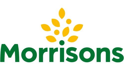
The 2021 logotype largely reuses the design before it. However, they did scrap the ‘since 1899’ part, while the color green became a lot brighter. But that’s about it.
Font and Color
The stable and clean title case lettering from the primary Morrisons badge is set in a modern geometric sans-serif font which looks simple yet confident. The closest fonts to the one, used in this insignia, are, probably, Crossten Bold or Rotunda Bold, but with the contours of the capital “M” modified.
As for the color palette of the Morrisons’ visual identity, it is composed of green and yellow in their deep and intense shades. The combination stands for quality and growth, also evoking a sense of an ecologically-friendly approach, and evoking such feelings and trustworthiness, and joy.


