Waste Management is the name of the environmental company, which was established in 1968 in the United States. Today it is one of the largest companies of the segment in the North America region, with hundreds of recycling and landfill sites and plants. The WM company manages almost 50% of all the waste of the country.
What is the symbol of Waste Management?
The symbol of Waste Management is the stylized monogram in green and yellow, the color palette, which is strongly associated with recycling. The bold uppercase “WM” abbreviation has the two characters glued to each other, stretched horizontally, and evoking a sense of stability. The “WM” looks very brutal and powerful despite its vivid and bright color palette.
Meaning and history
The Waste Management visual identity history was not very intense, it can be divided into two parts — the graphical logo and the text-based one. Both of them had only one version and both stayed with the company for many years.
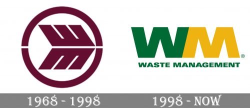
1968 – 1998
The original Waste Management logo was designed for the company in the same year, it was established, 1968, and stayed with it for almost thirty years, which is truly a lot.
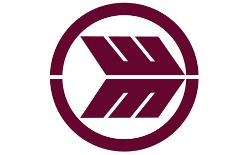
The logo was composed of an abstract symbol, enclosed in a circular frame. And that is it. No lettering, no additional graphics, nothing. The symbol of the company was a wide arrowhead, pointing right, into the future. It was placed in the right part of the circle, touching the frame with its sharp-pointed part.
The thin white horizontal line was coming through the whole emblem, dividing it into two halves. So the arrowhead started looking like two letters, “W” and “M”, mirroring each other.
This was a very cool and progressive emblem, modern, strong, and meaningful. It perfectly represented the company’s name, values, and character, which is truly remarkable and contemporary.
As for the color palette of the original version, it was composed of an intense brown and white, the colors of reliability, comfort, and loyalty.
1998 – Today
The redesign of 1998 brought a completely new concept to the Waste Management visual identity. The only thing the company kept from the first version is the mirrored letters “W” and “M”, however, their shape is now different.
Today’s logo is composed of an emblem, where two letters, “W” and “M” are placed on a white background. The letters are glued to each other but feature two different colors — green for “el and yellow for “M”.
Under the emblem, the company’s wordmark in all capitals is placed. Written in calm green, it is executed in a slightly extended geometric sans-serif typeface with strict lines and distinct cuts of the letters.
The green and yellow color palette of the company’s visual identity symbolizes nature and ecology, the things Waste Management takes care of and values most. Green also stands for growth and life, while yellow evokes a sense of friendliness and happiness, which the company tends to give to American citizens by making the earth cleaner and the air — fresher.


