Disney Princess (Princess Line) is a media franchise and toy-line including several fictional female characters from different Disney franchises.
Meaning and history
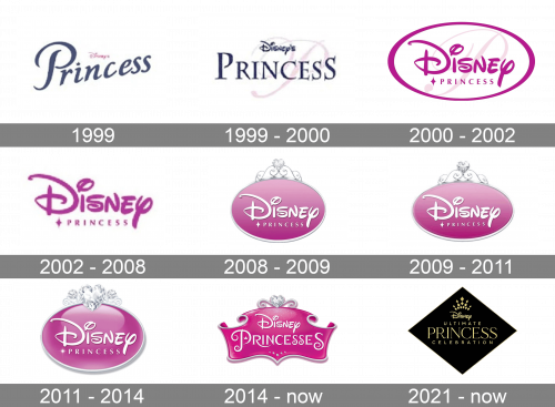
The Disney Princess logo has gone through at least eight modifications. And yet, it has stayed consistent in its sweet girlish style, which has been growing more and more pronounced with time.
1999
The original wordmark looked pretty modest in comparison with the following versions. You could see the word “Princess” in an elegant type inspired by handwriting. While the letters looked as if they had been written by hand and had the curves needed to join them, they weren’t actually joined and had white gaps in between.
The most distinctive character was the “i” with a small crown instead of the dot.
Above the word “Princess” in dark blue, you could see a tiny Disney’s wordmark in pink.
1999 – 2000
The handwritten type was replaced by block letters. They weren’t italicized and were oriented horizontally. Yet, they still looked girlish and elegant due to the varying widths of the strokes
2000 – 2002
The logo is now dominated by the Disney wordmark, while the word “Princess” is very small. The text is placed inside a white ellipse with pink trim.
2002 – 2008
The ellipse disappears from the main logo, while the text remains virtually unchanged. Yet, versions with a solid pink ellipse are also used during this period.
2008 – 2009
The logo is placed inside a pink ellipse with a gradient and silver trim. The decoration on the top imitates decorations on the crown.
2009 – 2011
The design gets a couple of slight, barely noticeable tweaks.
2011 – 2014
The brilliant heart on the top grows more prominent. The gradient has been redrawn to make it look glitterier and dimensional.
2014 – Today
The oval on the Disney Princess logo has been replaced by the banner. The heart has grown smaller. The word “Princess” has grown larger than “Disney” and now features a decorative script with plenty of swirls.
2021 – Today
The 2021 limited edition of Disney Princess is called the ‘Ultimate Princess Celebration’. It also has a unique black-with-gold design. For this one, they selected a black rhomb to be the emblem’s foundation. In its top, they placed Disney’s wordmark, crowned by several rays of smaller, golden rhombs.
The central was occupied by three lines of text, spelling the name of the edition. The central line – containing ‘Princess’ – had a much bigger letter size and used a distinct, more elegant font.


