Variety is a weekly show business trade magazine. The entertainment publication offers coverage of several industries, from film and TV to theater, music, and technology, aimed at entertainment executives.
Meaning and history
The magazine has been an example of rare loyalty to its visual brand identity. The Variety logo has looked virtually the same, with subtle modifications, ever since the first issues were published in late 1905.
Primary logo
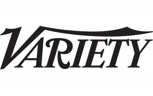
The Variety logo showcases the word “Variety” in an original script. The wordmark combines more or less “regular” letters with truly custom ones. The “A,” “I,” “E,” “T,” and “Y” are generally just italicized serif glyphs with average proportions. The “E” and “T” have very elegant serifs, though.
The “R” and the “V,” on the contrary, are the result of a more creative approach. The initial “V” is especially spectacular. Its elongated right end stretches above the whole word. The left top end is also longer than it should be and, together with the right end, adds a very dynamic “flying” impression.
In older issues, you can come across a slightly different version with elongated glyphs. There are also bolder versions.
According to some sources, in 2013, the logo was redesigned by Jim Parkinson. Parkinson an American type designer based in Oakland.
Daily Variety
Daily Variety was a Hollywood and Broadway daily edition offering breaking news and exclusive scoops. It was positioned as required reading for key show business players. It was published from 1933 to 2013. The brand was revived in 2019 in the form of a Mon-Fri email newsletter.
The logo of Daily Variety is slightly different. The most notable difference is that it always features a certain color, a subtly warmed shade of green. The glyphs are a tad bolder and, as a result, there is less space between them. Due to this, the “I” and “E” are linked by their top and bottom serifs.
And, of course, there is the word “Daily.” It is housed in a small green box and is set in a simple sans serif typeface.
Icon
The website showcases a shorter version of the logo, which is an icon featuring only the “V.” While the casual “flying” touch has been preserved, the letter lacks the elongated top right end it has in the primary logo.
Colors
Most often, you can see the wordmark either in red or in black. In both cases, the white background is used. Yet, this isn’t a strict pattern. The design of the logo offers endless possibilities in changing its color depending on the visual context.
Font
The wordmark doesn’t use a ready-made font. The shape of every glyph has been chosen specifically for the Variety logo, and the only reason why these letters are there is that they merge and create a single whole.


