Cartoonito is a renowned international children’s programming block and brand catering to preschool audiences. Owned by WarnerMedia, the brand ensures quality content that is not only entertaining but also educative for young minds. It has presence in numerous countries, mainly through its dedicated channels or programming blocks on other children-centric channels. Over the years, Cartoonito has brought many beloved shows to the screen, ensuring a healthy blend of fun and learning.
Meaning and history
Founded as a programming block by WarnerMedia, Cartoonito quickly ascended in the world of children’s television. From its inception, it was clear the brand had a knack for connecting with preschool audiences, offering a mix of shows that were both amusing and educational. Some of its most significant achievements include the development and broadcasting of a slew of original programs that have garnered international acclaim and appreciation from both parents and kids. Fast forward to today, Cartoonito holds a prominent spot in the hearts of many as a leading provider of quality preschool entertainment, maintaining its commitment to fostering learning through entertainment.
What is Cartoonito?
Cartoonito is WarnerMedia’s international children’s programming brand tailored for preschoolers. It offers a mix of entertaining and educational content, gaining recognition and popularity among young viewers worldwide.
2006 – 2018
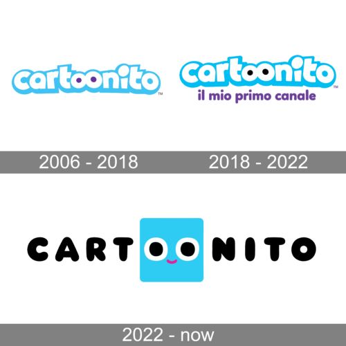
he first Cartoonito logo exudes a youthful vibrancy with its light blue lettering set against a clear white background. Its font employs rounded edges, encapsulating a gentle and child-friendly feel. The playful nature of the brand is further emphasized by the two “o’s” in “toon”, which are transformed into cartoonish eyes, making the logo seem animated and alive. The trademark symbol, subtly positioned at the end, speaks of the brand’s uniqueness and proprietary nature.
2018 – 2022
Building on the foundation of its predecessor, the second Cartoonito logo integrates an Italian phrase “il mio primo canale”, translating to “my first channel”, suggesting it as a primary choice for children’s entertainment. The central “toon” still retains its playful eyes, but here, the overall color scheme becomes more diverse, incorporating purple for the added text, creating a sense of variety and enrichment.
2022 – Today
Diverging from the traditional layout of its precursors, the third Cartoonito logo showcases a modern, minimalist design. The brand name is split, with “CART” and “NITO” in bold black lettering, flanking a bright turquoise square in the middle. This square, with its pair of round eyes and a pink-lipped smile, personifies the brand, injecting a dose of personality and charm. The simplicity of this logo, combined with its animated centerpiece, portrays Cartoonito as both contemporary and full of character.


