DeWalt produces power tools and hand tools for various industries, from construction to woodworking. The DeWalt logo conveys power and reliability.
Meaning and history
DeWalt is an American brand of power tools. Its history dates back to 1922 when engineer Raymond De Walt created the world’s first radial arm saw, which later became the standard for other companies’ power tools. During World War IIDeWalt fulfilled government defense orders.
Since 1992, the company positioned itself as a manufacturer of industrial tools, and chooses yellow and black colors for branded products – that’s what makes it recognizable. Later the assortment of DeWalt expanded considerably. The company began to produce screwdrivers, drills, wrenches, and cordless tools for home use.
Today DeWalt is a subsidiary of the largest concern Stanley Black & Decker and is the number one company in the United States in terms of sales of professional power tools.
What is DeWalt?
DeWalt is the name of an American company that is one of the world’s most famous manufacturers of power tools. The brand range includes a variety of hand-held power tools and equipment. DeWalt products are widely used in the construction, production, and woodworking industries.
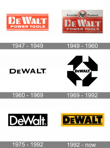
1947 – 1949
The brand was established in 1923 by Raymond E. DeWalt, who happened to be the inventor of the radial arm saw.
By 1947, the brand already had a distinctive emblem in red and white. The logo was dominated by the second name of the founder, which was given in bold serif letters. The type was somewhat unusual, especially the “D,” where the gap inside formed a triangle (or an arrow, if you please). You could also notice the triangular pattern in other glyphs. Apparently, the shape symbolized the sharp elements of the saw.
The words “Power Tools” in a simple sans could be seen below. They were much smaller and served as explanatory text. It was necessary as the design contained no other indications of the type of product the brand made.
The lettering was white over the rather bright and clear red background. Two white lines (above and below the text) were added as a finishing touch.
1949 – 1960
The updated design reflected the fact that DeWalt was purchased by American Machine & Foundry Co. Inc. The deal took place in 1949. The lettering “Another AMF product” appeared above the old logo. It showcased a highly legible and quite simple sans. The abbreviation “AMF” was set in a different type, which was rounded and elongated. There was a red ring around the three letters.
1960 – 1969
The DeWalt badge, used by the company in the 1960s, featuredsimple black lettering across a white background. The inscription was set in a modern geometric sans-serif font with the extended characters set in bold clean lines with straight cuts of the ends.
1969 – 1992
In 1969 the DeWalt logo was redesigned and became bolder, stronger, and sharper. The black emboldened inscription was now set on a white rhombus, framed by four geometric arrowheads, drawn in black. This abstract element looked very strong and evoked a sense of movement, kind of swirling, representing the specialization of the company.
1975 – 1992
In 1975 a plain minimalistic approach was brought back to the DeWalt logo, with the bold sans-serif inscription becoming the main thing in the badge. But this time the lettering was set in white, across the solid black horizontally-oriented rectangle, with no framing or additional decorative elements.
1960 – Today
When Black & Decker became the owner of DeWalt in 1960, the logo was changed once again. This time, the transformation went deeper affecting not only the shape of the glyphs but also the palette.
And yet, the authors of the logo of DeWalt Industrial Tool Company preserved the old structure, to create a visual link between the old and new versions. You could still see the name of the band in bold letters between two horizontal lines. The fact that all the other words disappeared made the emblem cleaner and easier-to-grasp.
Font
The type in the original DeWalt logo was unique and meaningful (the triangle as a symbol of the saw). While the current one may look generic, it is also cleaner and simpler. The bold glyphs symbolize the reliability and quality of the tools.
Colors
The current combination of yellow and black seems more recognizable than the red from the previous emblem. The red was great at conveying power (an essential message for the brand). And yet, the yellow and black do this job perfectly, too, and also help to make a logo that stands out.


