Celcom Axiata Berhad is known as the oldest mobile telecommunications provider in Malaysia.
Meaning and history
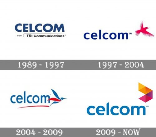
The Celcom logo has gone through at least four distinctive updates. And yet, it has always managed to preserve its visual core helping loyal customers identify the logo even after an update.
1989
The original logo featured the word “CELCOM” in a plain sans serif type. The ends of the glyphs appeared slightly rounded. The strokes forming the letters had equal width, which made the type look like a Helvetica-style font. Yet, in comparison with Helvetica, the glyphs had somewhat different proportions (more elongated, with narrower glyphs).
Below the name of the brand in blue, you could see the lettering “TRI Communications” in smaller black letters. It was paired with a black line imitating motion (not very successfully, though).
1997
The new design looked lighter, more dynamic, and unique without sacrificing its legibility.
The bold type was replaced by a regular one. In contrast with the original all-caps lettering, it was lowercased now. The width of the strokes slightly varied at several points, which added an elegant touch.
A red bird appeared in the top right corner. Apparently, it was supposed to symbolize the signal used in telecommunications to transmit information. Yet, one can argue that the bird has a too broad symbolic meaning (for instance, it is often used by airlines). It’s not perfectly fast, too. So, it is not the best choice for a telecommunications company.
Also, the edges of the bird’s wings were formed by multiple drops, which were difficult to reproduce.
2004
The bird was streamlined, which resulted in a more dynamic and easy-to-reproduce design. The type grew more unique, with a hi-fi touch.
2009
Celcom was grouped under TM International, which was later renamed Axiata Group. The hummingbird was gone. Instead, you could see an abstract geometric emblem. It was present both on the Celcom logo and the Axiata Group logo.


