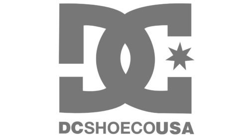
While the logo of the company DC Shoes has its unique and distinctive shape, you may still perceive a symbolic link to the Chanel badge. Due to the visual connection, we may assume that the DC logo is (maybe) trying to tell that the company is “Chanel in the world of skateboarding and snowboarding.”
Meaning and history
The history of DC traces back to 1994 when Droors Clothing was established by two co-founders, Ken Block and Damon Way. In fact, it wasn’t their first venture. A couple of years earlier, they also started the company called Eightball Clothing, as well as such projects as Blunt Magazine, Type A Snowboards, and Droors Jeans. It was Droors Jeans that eventually became Droors Clothing, which, in its turn, became DC.
In the spring of 2004, DC Shoes was purchased by Quiksilver. In 2011, in an effort to make the brand more popular, the iconic flag logo was introduced.
Symbol
The most striking part of the DC logo is probably the way it plays with classic symmetry. Also, you may get an additional clue if you compare it with the Chanel logo.
The “D” has white space on its horizontal bar, because of which it looks very much like an inverted “C.” The “C,” in its turn, has its two curves replaced by two angles, because of which it looks more like an inverted “D.” At this point, the most natural thing to do would probably be to design an image with two symmetrical parts, so that the left part is a mirror reflection of the right part. In this case, the emblem would look like the Chanel logo with a different “C.”
However, the designer took a different path. He sandwiched a black star in between the two ends of the “C” and also moved the white space on the “D” a bit lower to break the symmetry. Due to this, the logo acquired a distinctive and unique look. Nevertheless, the DC logo still bears a vague link to the Chanel logo and possibly our subconscious may classify the DC badge as “Chanel in the footwear for action sports.”
What does “DC” stand for?
The most intuitive answer to the question seems to be “Droors Clothing,” which is the name of the company out of which DC was formed. And yet, the official corporate legend states that the letters were taken from the names of the first two athletes assigned by the company, Danny and Colin.
DC Shoes and Comics emblems
There’s one more extremely well-known company using the initials “DC” as its name – DC Comics, which is among the biggest and oldest US comic book companies. The list of the superheroes developed by DC Comics employees is awe-inspiring and includes Batman, Superman, and Wonder Woman, to name just a few. DC Comics belongs to DC Entertainment, which, in its turn, is a subsidiary of Warner Bros.
Taking into consideration the similarity in the names of the two companies, it’s hardly a surprise that their logos have much in common, too. When the comic book company introduced a new emblem in 2012, quite a few people supposed it was an updated DC Shoes logo.
Font
The text below the emblem is given in a simple sans serif typeface looking very much like Nimbus Sans Black. This grotesque sans serif font was published by the firm URW++.
Colors
In terms of the color palette, the DC logo stays within the classic notion of elegance sticking to the combination of black and white. Come to think of it, the choice is commercially reasonable and fits the company’s specialization perfectly. As DC manufactures a wide range of products, their color scheme also varies considerably. A black-and-white badge is universal enough to fit any background.


