

![]() Wonder Woman Logo PNG
Wonder Woman Logo PNG
The most well-known female comic-book superhero of all time, Wonder Woman is an incredible combination of power and attractive appearance.
Meaning and history
![]()
The visual identity of a famous character has changed a lot since the introduction of its original version in 1941. The lines became sharper and stronger, showing the progress and power of the superhero.
What is Wonder Woman’s catchphrase?
As any other woman, the Wonder Woman character doesn’t have just one catchphrase, but several. The most famous is “By the Spear of Athena!”, and “Neptune’s Trident!”. Although she also uses such battle cries as “Shades of Pluto!”, “Thunderbolts of Jove!”, “Great Hera!”, and “Suffering Sappho!”
1941 – 1942
![]()
The very first emblem for Wonder Woman was created in 1941 and featured a very smooth and elegant badge in the art-deco style. It was a solid Ted background where the Golden-yellow bird was placed vertically with its wings up. The contours of the bird were arched and rounded, and thin black lines were added to its body for delicate accents.
1942 – 1949
![]()
The bird from the Winder Woman’s visual identity was refined and drawn with more attention to detail. The wind got larger, and more lines were now drawn on them to accent in feathers. The color palette remained the same, but as the body of the bird got enlarged, more light gradients were now present in the image.
1949 – 1959
![]()
The redesign of 1949 has worked on the contours of the Wonder Woman birdie, keeping the style and the color palette of the previous versions, but creating a more abstract and unique look. The main thing about the new emblem was in the shape of the bird’s wings, which got some rounded arched elements, resembling the wings of a butterfly. This version of the icon was used for the superhero for ten years.
1959 – 1968
![]()
In 1959 the Wonder Woman logo gets another redesign. The bird was now drawn in a completely fantasy style, with the bottom part narrowed, making up a shape of the logo remind of a trophy, and the wings drawn in two circles, resembling two ancient fans with their feather-accenting lines. The color palette of the badge remained untouched.
1972 – 1981
![]()
Another redesign of the Winder Woman logo was held in 1972, creating a come thing new, but still in connection to the previous versions. The bird turned into a figure of a woman, with the two circular wing now drawn as the sleeves under the stylized arms, spread up and to the sides. The bottom part of the figure was now flared, resembling the contours of an elegant gown.
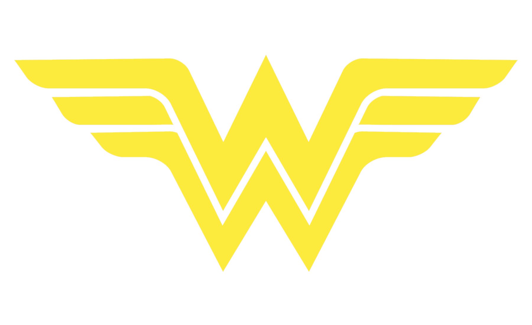
1981 – Today
![]()
In 1981 another badge was introduced and it is still used by the brand today. A stylized emblem, composed of two letters “W”, placed one above another, with their bars elongated and spread to the sides. The badge was available in various color options, but the main palette was composed of black, white, and yellow.
1994
![]()
In 1994 the iconic WW badge got elegantly refined, with the improvised wings being elongated and arched. The badge repeated the original color palette of the Wonder Woman logo, a yellow and black one, but looked differently. This version of the logo was only used for the superhero for a few months, being replaced by a more geometric badge in 1995.
1995 – 1998
![]()
The redesign of 1995 has introduced a more powerful logo, with the elongated wings drawn triangularly, and getting a solid yellow triangle at the base of the monogram, supporting the new geometry of the badge, and creating a very balanced and strong look, which perfectly reflected the power of Wonder Woman.
1998 – 2006
![]()
In 1998 the female superhero gets another logo, which was completely different from the previous versions in terms of colors and style, even though, it was pretty similar in the idea and composition. The new logo was set in a smooth copper-to-beige color scheme, with the elegant arched wings of the “W”, and no separation lines inside it.
2006 – 2011, 2016 – Today
![]()
The redesign of 2006 brought the original red and yellow color palette to the Wonder Woman visual identity, though the red in this version is darker and more intense. As for the main symbol, the double-W gained a bird’s head, with strict lines of the beak. The new symbol looks powerful and modern, reflecting the character and its essence.
2011 – 2016
![]()
For five years, starting in 2011, there was another logo, used by the superhero. It was a light-gold badge in a black outline with sharpened angles and slightly arched lines of the wings. This emblem looked a bit more feminine, though still evokes a sense of strength and danger.
2016 – Today
![]()
The logo introduced for Wonder Woman in 2016 is a three-dimensional badge with straight lines executed in the dark gold shade. The symbol repeats the composition of the previous versions, composed of two “W”s and a bird’s head, but in the new execution, it looks stricter and more powerful than ever.
Font
![]()
The distinctive letter “W” does not belong to any of the existing typefaces. It was created from scratch and tweaked quite a few times throughout the history of the heroine.
Color
The colors of the American flag have been the basic colors of the Wonder Woman’s costume, while her emblem in most cases has featured the gold color.
Why is Wonder Woman a feminist icon?
Wonder Woman is considered to be a feminist icon, as her character symbolizes equality and women’s power. The first person, which introduced this idea was Tim Hanley, a famous historian.
How old is the Wonder Woman logo?
The first logo of Wonder Woman was designed at the beginning of the 1940s, but the predecessor of the current badge appeared only in 1982. As for the modern version of the spender a woman logo, it was designed in 2017 and stays unchanged today.


