

![]() The North Face Logo PNG
The North Face Logo PNG
The North Face is one of the leading US outdoor product manufacturers, which focus in designing and selling outerwear, footwear, and equipment such as backpacks and sleeping bags.
Meaning and history
![]()
North Face is one of the brands, that follows its chosen paths from the first days and never step off from it. The company was established as a manufacturer of outdoor and mountain apparel, with the snow peaks and low temperatures in mind, and its iconic logo, introduced in the 1960s, is not that simple as it may seem.
1966 — 2010
![]()
The North Face logo, designed for the brand in 1966, featured a monochrome badge with a three-level inscription, placed on the left from the bold abstract emblem.
The emblem of the brand, composed of three-wire arched lines, which stand for the Half Dome mountain peak in California, which is famous for its unusual shape and smooth rounded lines.
The monochrome color palette of the original logo version made the image powerful and solid and could be placed on almost any color of the background and texture, being written on a tag, resin badge, or embroidered on the brand’s clothing.
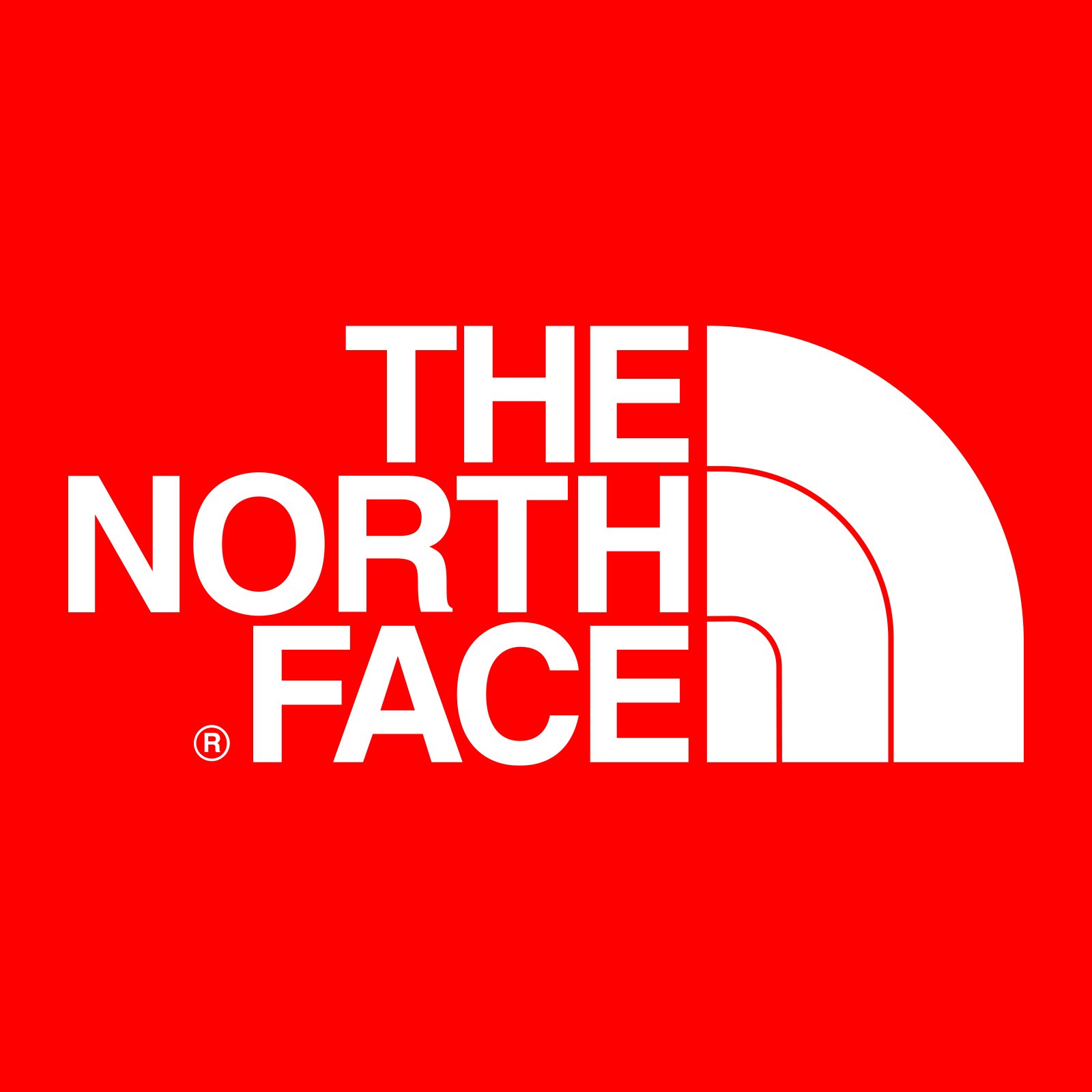
2010 — Today
![]()
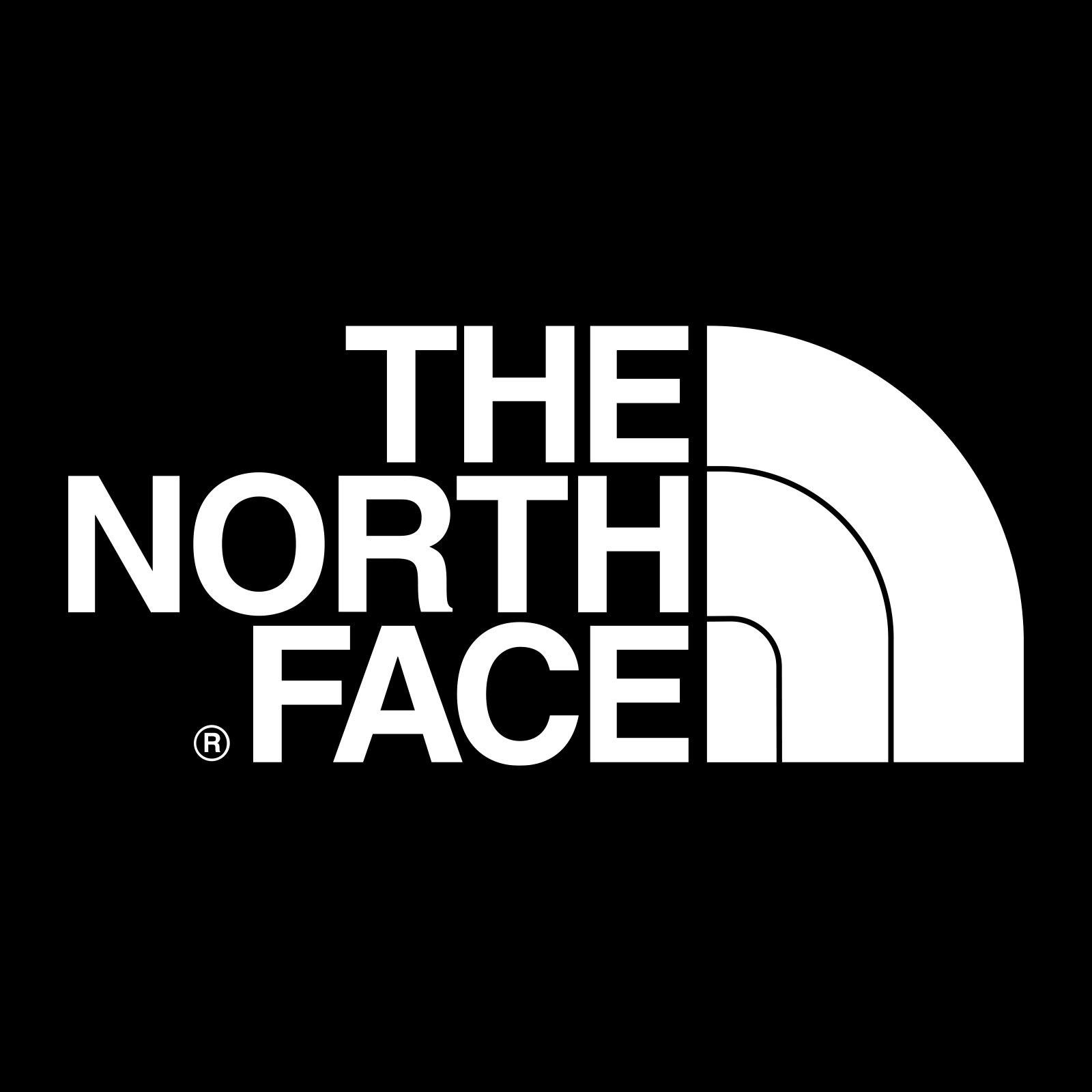
The redesign of 2010 didn’t change much in the North Face logo, just brought brightness and energy with the new red and white color palette, where the whole lettering and emblem were placed on a scarlet-red square. The combination of red and white stands for power, progress, and dynamics, perfectly reflecting the character and purpose of the brand.
As for the worm dark itself, it is still written in all capitals of a bold yet neat and traditional sans-serif typeface, which is very similar to such fonts as Sequel Sans VF Disp Semi and Neue Helvetica Georgian Bold 75.
Symbol
For the first three years of its existence, the North Face did not have a distinctive logo. It was only in 1971 that David Alcorn, a designer from California, came up with what has been the company’s emblem ever since.
Emblem
The North Face logo is a combination of the wordmark and a quarter-circle. The latter is meant to evoke Yosemite National Park’s Half Dome, a granitic rock formation rising over 8,700 feet above sea level. The mountain’s name was clearly inspired by its distinct shape.
Font
Although the serif all-cap type featured in the North Face logo does not have any really unique features, it is clear and highly legible. Due to this, there is never any doubt as to what company the logo belongs to.
Color
The company chose red as a symbol of physical energy and courage. The white letters and emblem stand out against such a background. Previously, the North Face used a black-and-white logo.


