Dacia is the name of the most famous Romanian automaking company, which was established in 1966 and acquired by Renault Group at the end of the 1990s. The brand is specialized in the production of low-budget cars, which are getting more and more popular across the globe.
Meaning and history
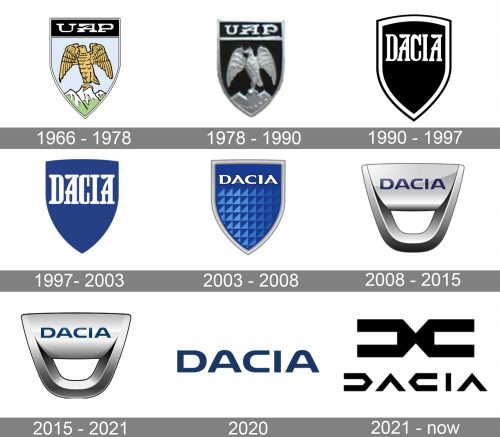
For the first two decades of its history, the Romanian carmaking company was called UAP and featured a strong and traditional heraldic logo, which by today evolved into a modern minimalist emblem, reflecting the progress and growth of the brand.
What is Dacia?
Dacia is one of the European cars Marques, known for the production of sedans and city cars in the low and medium budges segment. Owned by Renault Group, it was established in Romania in 1966.
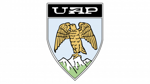
1966 – 1978
The original UAP logo was composed of a traditional crest with a black top part and a thin silver outline. The black banner of the badge comprised a sleek silver lettering in a custom typeface, with the unique contour of the “A”.
As for the main part of the crest, it featured a light sky-blue background, where the brown eagle was drawn. The bird was sitting on a stylized mountain, executed in a green and white.
Eagle on the logo stood for strength and determination, while the landscape was a tribute to Romania. It was a detailed and memorable badge, which stayed with the brand for ten years.
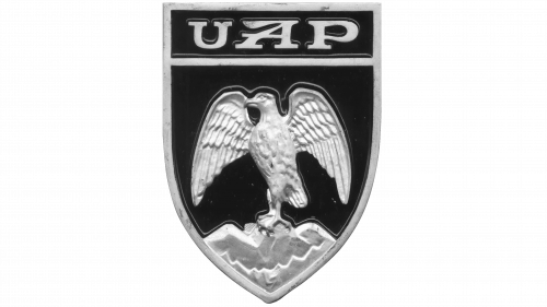
1978 – 1990
The badge became three-dimensional and the color palette was simplified to black and silver in 1978. Executed in metallic gray, the eagle was now more abstract, as well as the mountains it was standing on. Though with the new color scheme the “UAP” lettering became more visible and eye-catching.
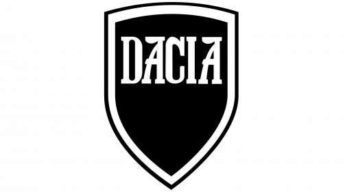
1990 – 1997
After the acquisition of the marque by Renault in 1990, the UAP name was changed to Dacia, and the new badge was introduced. It was a simple monochrome crest with traditional contouring. The body of the crest was plain black, comprising white old-style lettering on its upper part and a double black and white outline.
Both letters “A” of the new wordmark resembled the “UAP” inscription, with their upper bars smoothly elongated.
1997 – 2003
The monochrome palette of the Davis logo was replaced by blue and white in 1997. This made the badge more recognizable and dynamic and added some freshness to the company’s visual identity. The outline was removed from the crest, but the absence of a frame was balanced by an enlarged inscription in white. The iconic letters “A” still featured the same recognizable contours.
2003 – 2008
2003 was a year of big changes for the Dacia visual identity. Though the color palette remained the same — blue and white, and the shape of the crest was only slightly refined, the mood, style, and character of the badge became completely different.
The bright blue crest in a thick gray outline had the white wordmark in a new sharp typeface with pointed edges, placed above a geometric pattern, which consisted of numerous right angles drawn in a lighter shade of blue.
2008 – 2015
The first version of the badge we all can see today was introduced in 2008. It is a modern interpretation of the classic crest, executed in glossy metallic color with smooth sleek contours. The shield-like emblem featured its bottom part rounded and having a hole, repeating the shape of the badge. Above it, there is a blue “Dacia” inscription in a soft modern sans-serif. The letters have a delicate white outline, which makes them more visible on a gradient surface of the badge.
2015 – 2021
The lines and colors of the logo have been refined in 2015. The color palette and shapes remained the same, but due to slightly elevated shades and accents, the badge started looking really strong and professional.
2020

The redesign of 2020 has introduced a simplified Dacia logotype, which was taken from the previous version. This time the clean and smooch uppercase inscription was placed not on a silver emblem, but a plain white background, and the new minimalist approach of the brand showed its ability and willingness to change and adapt to modern trends.
2021 – Today
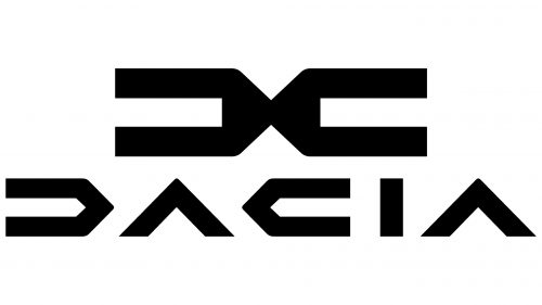
Only a few months after the redesign of 2020, Dacia has held another rebranding. The emblem, created for the brand in 2021 is something completely new and can not be compared to all the previous badges of the marque. The new logo is composed of an abstract geometric emblem placed above the stylized logotype in all capitals. Both elements of the visual identity are executed in solid black thick lines with numerous sharp angles and slightly extended contours. The new Dacia emblem boasts a composition of two mirrored “C”-like symbols, placed back-to-back.
Font and color
The Dacia logotype is executed in a custom sans-serif typeface, which is probably based on one of the following fonts: Tussilago Heavy, Kinn Bold, or Nulshock Bold. But the contours of the letters are cleaned and modernized, being rounded and extended.
The silver and blue color palette of the badge is one of the most popular combinations among not only car brands, but also technology and electronic companies, as this scheme evokes a sense of high quality, trustworthiness and responsibility.


