Crowne plaza is a brand of a multinational chain of full service, upscale hotels headquartered in the United Kingdom. It is a part of the InterContinental Hotels Group family of brands, which include Inter Continental Hotels & Resorts and Holiday Inn Hotels & Resorts, and operates in nearly 100 countries with more than 3600 hotels and 118,000 bedrooms.
Meaning and history

Crowne Plaza is one of the InterContinental hotel brands, which already means the great quality of accommodation and services. Established in the United Kingdom at the beginning of the 1980s, today the company owns hundreds of hotels worldwide and keeps growing annually.
The Crowne Plaza chain was founded by Holiday Inn, another huge hospitality corporation, known all over the globe. But the corporation was acquired by the bigger player, InterContinental, in 1988.
What is Crowne Plaza?
Crowne Plaza is the name of a British hotel chain, which was established in 1983, and by today has grown into an international chain with more than 400 hotels across about 100 countries around the globe. The chain is owned by the InterContinental Hotels Group.
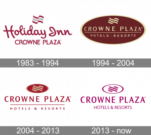
1983 – 1994
Until 1994 the chain was still named Holiday Inn, as an upscale division of its original mother company. The first hotel under the new name of the brand was opened in 1999 in Portugal. This is how the intense and bright history of the Crowne Plaza hotel chain officially began.
1994 – 2004

The very first logo for Crowne Plaza was designed in 1994 and stayed in use by the hotel chain for more than twenty years. It was a horizontally stretched ellipsoid with a solid burgundy background and a thick golden frame. On the badge, there was a two-leveled inscription, horizontally separated by a thin gold line, and followed by a small graphical emblem, set on the top part of the badge. The emblem featured a stylized gray, composed of three waving parallel lines. As for the logotype, the upper “Crowne Plaza” line was set in the uppercase of an elegant sans-serif, white the bottom “Hotels Resorts” used a simple traditional font for its smaller size capital letters.
2004 – 2013

The redesign of 2004 added glance and volume to the Crowne Plaza badge, redrawing it in a modern and strong manner. The lettering was now colored red and set on a white background, as for the emblem, the golden flag was now drawn over the gradient burgundy horizontally stretched ellipsoid in a golden frame, and set above the inscription. The wordmark got its typeface refined and the letters slightly narrowed; which added confidence and stability to the mood of the badge. The bottom line of the lettering now more often featured the name of the location and was executed in the same typeface as the main logotype, but with the letters in a smaller size.
2013 – Today
The Crowne Plaza visual identity is the newest achievement of the design philosophy, which builds the brand’s recognition in its sector and drives engagement with its guests.
The Crowne Plaza logo is a flag-shaped emblem inside an oval holding device, which sits above the hotel name in an all-caps, sans-serif typeface.
The flag-shaped icon, made up of three wavy lines, has been used as a shorthand for the logo across communications, and the wavy line has been used as a motif to frame print materials and complimentary products packaging.
Crowne Plaza’s signature color is purple and complimented by white on the brand’s logo. On other materials and packaging the purple has been minimized and used alongside a color palette of yellow, orange, light blue, baby blue, grey and white.
Font and Color
The elegant yet stable uppercase lettering from the primary badge of Crowne Plaza is set in a fancy modern sans-serif typeface with slightly flared bars of the characters. The closest fonts to the one, used in this insignia, are, probably, Ocean Sans Pro Semi Bold, or Delamere Bold, but with some modifications.
As for the color palette of the Crowne Plaza’s visual identity, it is based on a deep and Royal shade of burgundy, close to purple, which evokes a sense of excellence and professionalism, and shows the strongest sides of the company and its fundamental approach and professionalism.


