Days Inn is a hospitality brand, owned by Wyndham Hotels, which contains over 1,5 thousand hotels worldwide. The chain was established in 1970 and today is one of the largest in the industry, with almost 140 thousand rooms.
Meaning and history
Days Inn, a renowned hotel chain, was founded by Cecil B. Day in 1970. This venture marked the beginning of a remarkable journey in the hospitality industry. Day, a real estate developer, launched the first Days Inn on Tybee Island, Georgia, with the goal of providing affordable and comfortable accommodations.
Throughout the years, Days Inn has achieved significant milestones. It quickly expanded, emphasizing value and quality for budget-conscious travelers. The brand became synonymous with affordable lodging, spreading across the United States and internationally. By the 1980s, Days Inn had established itself as a major player in the economy lodging sector, recognized for its consistent quality and value. This period saw the introduction of innovative concepts like the “Days Inn Sunburst,” a symbol of the company’s commitment to quality service.
In its current position, Days Inn continues to thrive as a subsidiary of Wyndham Hotels & Resorts, one of the world’s largest hotel franchising companies. The chain maintains its focus on providing budget-friendly accommodations without compromising on comfort, catering to travelers seeking reliable and accessible lodging options. With hundreds of properties worldwide, Days Inn remains a popular choice for travelers, symbolizing a balance between affordability and quality in the hospitality industry.
What is Days Inn?
Days Inn is a well-established budget hotel chain known for offering economical and comfortable lodging options. It caters to travelers seeking quality accommodations at an affordable price, maintaining a widespread presence globally.
1970 – 2007
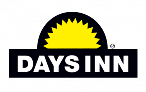
The first Days Inn logo was designed in 1970 and stayed with the brand for more than 30 years. It was a bright black and yellow badge, which is the basis of the logo we all know today.
The original Days Inn emblem was composed of a black rectangle with a wordmark and a half-circle with the yellow sun image on it. It’s sharp angles in yellow look strong and full of energy in combination with black.
2007 – Today
The redesign of 2007 brought a new color palette and refined lines to the Days Inn logo. The black was changed to blue, the sun emblem gained more rays, which are none thinner and longer, the wordmark was completely modified.
All-caps of strict straight sans-serif was replaced by a modern and smooth inscription with only “D” and “I” capitalized. The wordmark looks more balanced and contemporary now. Later, in 2017, “by Wyndham” tagline was added in fine simple sans-serif.
The Days Inn logo is bright and welcoming, evoking a sense of comfort and friendliness. It is traditional and timeless, a perfect visual identity for a hospitality segment.


