Cirque du Soleil is the name of one of the most famous circus in the world, created in 1984 in Canada. Today the show, established by Guy Laliberte and Gilles Ste-Croix, runs globally and has its theaters and clubs all over the globe.
Meaning and history
The Cirque du Soleil logo has always been based on the image of the Sun. It is a part of the Circus of the Sun nature, and it is what makes it recognizable and iconic.
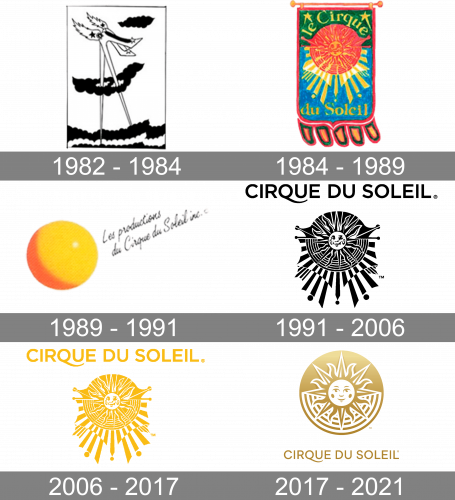
The very first Cirque du Soleil logo was designed in 1984 and was a simple hand-drawn banner with red and yellow Sun image on a green and blue background with a yellow inscription.
1982 – 1984
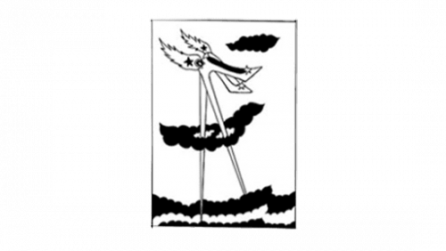
The original logo was a monochrome illustration confined within the boundaries of a tall, vertical rectangle. It depicted two shoes with extremely high heels extending from what looks like foamy ocean to the level above the clouds, which associates it with the Sun. The shoes also have two fiery banners attached to them, which reinforces the point.
1984 – 1989
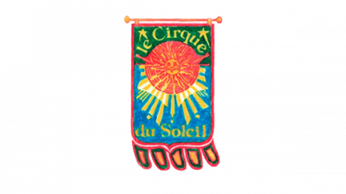
The 1984 logo was more like a circus banner, for a change. It’s an illustration of one – a mostly red cloth with green and blue innards. In its top section, there’s a picture of a red Sun almost as it is in the later iterations. There are also more details, like the name of the organization – ‘le Cirque du Soleil’ – written in yellow and broken into two parts above and below.
1989 – 1991
In 1989, they produced a more down-to-earth logo. It was a simple yellow ball with illumination and shading. Next to it, there’s a black hand-made text saying ‘les Productions du Circus du Soleil inc.’ written diagonally.
1991 – 2006
The first professional logo appeared only in 1991 and was executed in the yellow and white color palette, with an image of the smiling sun, placed inside a geometrical pattern with many rays, going from the center. Later the logo was slightly modified and the color was changed to gold.
2006 – 2017
In 2006, they basically just colored the entirety of the previous logo yellow (after the Sun), and that’s it.
2017 – 2021
The last redesign of the Cirque du Soleil logo was in 2017. The company decided to simplify their visual identity as removed all the additional graphics, just the Sun in the circle remained, and an elegant inscription in a sans-serif typeface, with the elongated tail of the letter “Q”.
The light gold and white color palette of the Cirque du Soleil logo evokes a sense of warmth, creativity, and magic. It represents one of the most famous shows making companies in the world, the one that brings celebration and happiness to people and never stops impressing.


