Eaton is a global corporation, specialized in developing and production of power equipment for various industries. The company was established in 1911 in the USA and today headquarters in Ireland with its operation offices all over the globe.
Meaning and history
Eaton Corporation manufactures specialized products for the industrial, automotive, construction, commercial, and aerospace markets. The company offers hydraulic products and hydraulic connectors, power distribution and control equipment, truck drivetrain systems, engine components, and a broad range of controls.
Established in the United States, today Eaton does business worldwide, with more than 170 offices and almost a hundred thousand employees on different continents.
What is Eaton?
Eaton is an American company, which was established at the beginning of the 20th century, and by today has grown into a world leader and manufacturer of electrical equipment for various markets
1911 – 1916
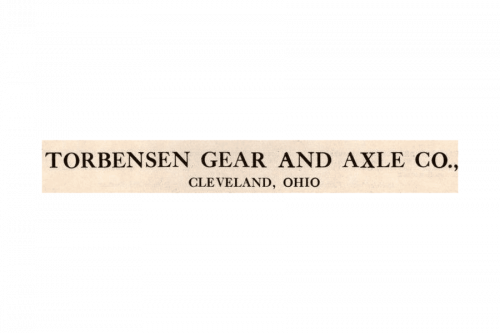
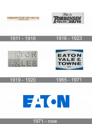
The first logo of the company (then called ‘Torbensen’) was rather an inscription to put on billboards. It consisted of the brand name proper and the address of the firm below.
1916 – 1923
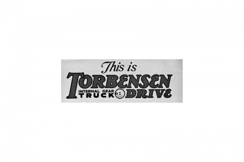
The next brand logo was an inscription ‘this is Torbensen Drive Internal gear truck’ made in multiple typefaces. The first two words had a handwritten font; the ‘Torbensen Drive’ lettering used a bold cartoon-style type with serifs; ‘Internal gear Truck’ part was written in a bold black sans-serif style, though the word ‘Truck’ was enlarged and had big gaps.
1919 – 1920
When Torbensen became Eaton, the logo was changed as well. It became an inscription with the brand name and the word ‘axles’ below. Both words had a 3D font with rounded letters. The background consisted of four rectangles colored different shades of white.
1965 – 1971
The 1965 logo featured an inscription ‘Eaton Yale & Towns Inc’ in a simple sans-serif font with bigger gaps between letters. The background for it was a white square with uppermost and lowermost areas colored blue.
1971 – Today
The Eaton text-based visual identity is bold and bright. Using a simple blue and white color palette, it still looks fresh and modern due to the thickness and spacing of its letters.
The Eaton wordmark in all capitals is executed in an extra bold sans serif typeface. The enlarged letters of the nameplate are touching each other and even overlapping.
The three letters, “E”, “T” and “N” are drawn in bright blue, while the “A” and “O” are white. This makes the logo more lightweight and crispy, balancing the thickness of the letter-forms and the absence of space between them.
The blue and white color palette of the Eaton logo is a representation of a professional and trustworthy brand, which values expertise and innovations. Blue is a symbol of reliability and authority, while white symbolizes pore intention as and loyalty of the company to its customers.
The bright and crispy Eaton logo is remarkable and memorable. It makes the brand stand out in the list of its competitors and shows it as progressive and creative.
Font and color
The massive uppercase lettering from the primary Eaton Corporation badge is executed in a heavy geometric sans-serif typeface, with the letters overlapping each other. The closest fonts to the one, used in the Eaton insignia, are, probably, Lesotho Black and TOMO Bossa Black.
As for the color palette of the Eaton Corporation’s visual identity, it is set in white and blue, the combination, which is most commonly used by the companies of tech and computer segments. These shades normally stand for quality and protection, along with professionalism and an innovative approach.


