Westfield Group was an Australian shopping center company. The first development, which opened in the summer of 1959 in Blacktown, was called “Westfield Place.” The following year, the company was floated on the Australian Stock Exchange. Before 1961, it built another five centers in New South Wales.
Meaning and history
The company was exceptionally consistent in its visual brand identity. Over its history, which lasted almost 65 years, it stayed loyal to the once chosen shape. The simple palette of the Westfield logo remained unchanged, too.
The logo features the name of the company in a unique, elegant type with a slight “historic” touch. The shape of some of the glyphs (most notably, the initial) has been inspired by the Gothic script (Blackletter), although it is by far better legible than actual writings made by medieval people.
The reason why Westfield opted for the “ancient” theme seems quite obvious. The company wanted to present itself as an old and reputable one (maybe the one that had dealt with the properties of aristocratic families). Taking into consideration that reputation is crucial in the property development business, these connotations couldn’t have been more appropriate.
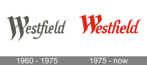
1960 – 1975

The original logo depicted just the name of the brand, written in a complex Gothic type of font with many joint points between the letters and a particularly big starting letter. They’ve colored it grey for the time being.
1975 – Today

The combination of the bright red color with the white background seems a great way to make the Westfield logo eye-catching.
In 2014, the Group split into two independent companies: Scentre Group (it is currently responsible for the Australian and New Zealand Westfield shopping center portfolio) and Westfield Corporation (it is currently responsible for the American and European center portfolio).
Fond and Color
Until 1975, the logotype of Westfield entirely used the color grey. After the redesign, they opted instead for a bright red look.
The font used for Westfield logotypes is a purposefully old-fashioned Gothic design, which resembles scripts that were particularly popular in the 19th century and before. It seems highly typographical and features a lot of joint points between the letters, as well as a high level of artistic liberty.


