

![]() Kalamazoo Wings Logo PNG
Kalamazoo Wings Logo PNG
The current incarnation of the Kalamazoo Wings began as the Madison Kodiaks in 1999. Having spent only one season in the state of Wisconsin, the ice hockey team relocated to Kalamazoo, Michigan. There the franchise took the place of the original Wings who let them use their name and logo, as well as their 26-year-old history.
Meaning and history
![]()
The Kalamazoo Wings, a professional ice hockey team based in Kalamazoo, Michigan, were founded in 1974 by the Parfet family, prominent local business owners. Since their inception, the Wings have been a significant part of the local sports culture, contributing to the community’s identity and enthusiasm for ice hockey. The team started as a member of the International Hockey League (IHL) and has undergone several affiliations and league changes over the years.
One of the main achievements of the Kalamazoo Wings is their notable success in the early years, including winning the Turner Cup as IHL champions in the 1979-1980 season. This victory marked a significant milestone in the team’s history, fostering a loyal fan base and establishing the Wings as a formidable force in minor league hockey. Over the years, the team has served as a developmental platform for aspiring players, many of whom have gone on to have successful careers in the NHL. As of now, the Kalamazoo Wings are a part of the ECHL and continue to be an integral part of the community, known for their competitive spirit and engagement with their fans. The team maintains its commitment to providing high-quality hockey entertainment and nurturing talent in the sport.
What is Kalamazoo Wings?
The Kalamazoo Wings, a professional ice hockey team, compete in the ECHL, known for their rich history and community involvement.
1999 – 2000
![]()
The original Kalamazoo Wings badge was created in 1999 and only stayed with the club for a few months. It was when the name of the club was Kodiaks. The logo was dark and simple — with the brown bear holding a brown hockey stick, and a green massive wordmark placed along with the stick. The inscription was executed in a custom sans-serif with each letter three-dimensional, and the circular negative space of the “O” replaced by a bear’s paw mark, in black.
2000 – Today
![]()
The new K-Wings didn’t abandon the logo of their predecessors. The reason for this is evident ‒ the original Wings’ logo was good. They just recolored it having changed the color palette from green, black, gold and white into blue, red and white. What they got was a traditional color scheme as far as ice hockey is concerned.
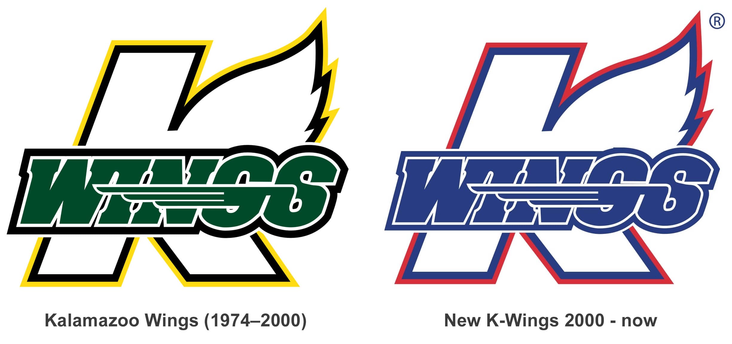
The Wings’ logo is simple, but it makes its point. It features the letter “L” that stands for the city of Kalamazoo. One of the elements of the letter is stylized and looks like a wing. The “K” is in white trimmed in blue and red. There is another wing on the wordmark with the team’s name. It is attached to the letter “S” on the left. The word “Wings” goes across the letter “K”. It is in blue bordered in white and blue. The letters are slanted, which gives an impression of speed to the whole thing. No wonder the Wings still use one and the same logo.


