Charleston Cougars is the name of an athletic program from the College of Charleston, which was established in 1770 in South Carolina, and is based in Charleston. The public liberal college’s sports program consists of 20 men’s and women’s teams in various sports disciplines but is best known for its Equestrian team.
Meaning and history
The most titled team of the Charleston Cougars program is the Equestrian team, which has been keeping the champion’s title for several years in a row, but the College is also known for its football club, which was one of the first American college football teams, playing since 1897 till 1923. The Charleston Cougars are members of the Colonial Athletic Association and compete in the first division of the National Collegiate Athletic Association.
What are Charleston Cougars?
Charleston Cougars is the collegiate athletic program of the public liberal college based in Charleston, South Carolina. The program is composed of 20 men’s and women’s teams, which take part in games and championships in various sports disciplines, including Equestrian, Beach Volleyball, Baseball, Basketball, Soccer, and others.
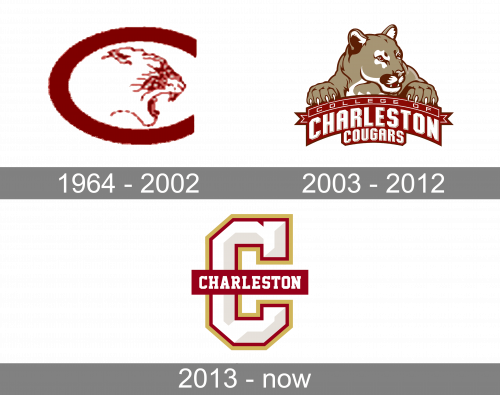
In terms of visual identity, Charleston Cougars was open to experiments throughout the years, so the deep red color is the only thing that unites the badges, designed for the athletic program of the College of Charleston during its history.
1964 – 2002
The Charleston Cougars badge, introduced in 1964, featured a laconic combination of a horizontally extended solid red uppercase “C” with a contoured profile of the cougar cat drawn in its negative space. The animal was looking to the right and had its mouth open, evoking a sense of determination and readiness to attack an enemy.
2003 – 2012
The redesign of 2003 showed another side of the cougar — a soft and cute wild cat was drawn in beige-gold above the arched red banner with white lettering. The animal had its head turned to the right. It looked innocent and sweet, completely different from the dangerous cat on the previous badge. The lettering under the cougar was set in three lines — the arched “College Of” in lightweight sans-serif and bold shadowed “Charleston” in massive geometric font, and the smaller and straighter “Cougars”, executed in the same style and typeface as the middle line of the badge.
2013 – Today
In 2013 Charleston Cougars stopped using a cougar image in their logo and made everything minimalistic and simple. The new concept is built around the enlarged and emboldened capital “C” in white, with gray shades, making it look voluminous, and a double red and yellow outline. The letter is set in a square serif font, which looks strong and stable. The white “C” is crossed by a narrow geometrically stretched banner with the white “Charleston” executed in the uppercase of the same typeface the “C” uses.


