Columbia Lions is the name of an athletic program from one of the most prestigious American educational organizations, Columbia University, which was established in 1754 and is based in New York. The program of the university is composed of 31 men’s and women’s sports teams, which all compete in the first division of the National Collegiate Athletic Association.
Meaning and history
Columbia Lions is a member of the Ivy League, an athletic conference, created in 1964, and composed of just eight members. The League is affiliated with the first division of the NCAA. Ivy League has 33 sports disciplines in its line-up, and the athletic program of Columbia University has teams in 31 of them, which is truly outstanding.
What is Columbia Lions?
Columbia Lions is a collegiate athletic program of Columbia University, a member of the Ivy League, the most prestigious collegiate association in the United States. The program consists of 14 men’s and 16 women’s teams, which compete in such sports disciplines as Baseball, Rowing, Soccer, Squash, Tennis, and many others, and one Co-Ed team in Fencing.
As for the visual identity, Columbia Lions has its logo drawn in a vivid and fresh light-blue color palette, which is a rare thing to see on the badges of the college athletic programs. As for the overall style and design of the badge, it has been changed many times grouchier the years, but the depiction of a lion has always been there.
1936 – 1956
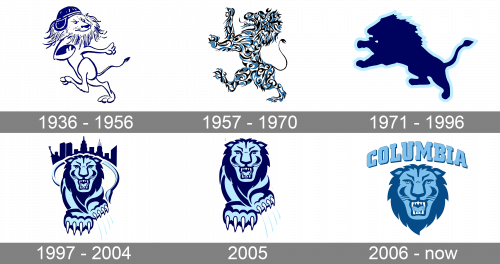
The Columbia Lions logo, designed in 1936, stayed with the sports teams of Columbia University for almost twenty years. It was a naive and fun badge with just a draw of a Lion, wearing a rugby helmet and running with a rugby ball in its hands. The animal was contoured in blue, and all the additional details were executed in the same color. No lettering was present on the badge.
1957 – 1970
The redesign of 1957 introduced a complicated stylized badge with the Lion drawn in a heraldic style, like a lion rampant. But its style and pose were not the most important, the most important and interesting thing in the badge from the 1960s was its color palette. The lion was painted in blue, white, and black ornaments with some vignettes and curved bold lines. It was something unique not only for those times but even for the modern ones.
1971 – 1996
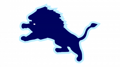
In 1971 the Columbia Lions teams go minimalistic with the logo. The new badge depicts a solid blue silhouette of a lion, which stands on its hind legs and seems to be preparing to jump to the left. The image featured a thick sky-blue outline, and this was the only addition, as no lettering or monograms were still present in the logo.
1997 – 2004
The redesign of 1997 redrawn the lion in a sky-blue and deep-blue color palette, with the lion depicted crouching forward towards the viewer. The animal had its tail arched, creating a kind of a rounded framing, and the dark blue silhouette of the city landscape was drawn above the tail. Four light stripes were drawn in the lower right part of the logo — traces of Lion’s claws.
2005
In 2005 the logo of the Columbia Lions was simplified, with the tail and the landscape removed. Now only the animal itself and the four claw traces were depicted on the badge. The color palette and all the details of the animal’s image remained the same. This version of the logo was only used for a few months, which is understandable since it looked somehow inferior and unfinished.
2006 – Today
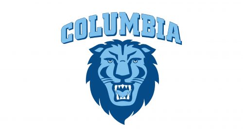
The redesign of 2006 introduced the first badge with the inscription. It is an image with the lion’s head in a blue color palette, composed of two shades, set under the bold capitalized “Columbia” lettering in the uppercase of a square serif typeface. The inscription uses a light shade of blue for the bodies of the letters, and a dark shade — for their thin outlines. The upper border of the lettering is arched from the center, while the bottom line is straight.


