There are always more and less powerful names. Those, that evoke a sense of strength and stability, and those, which feel smooth and light. The letter “R” in the name of a brand or a person is a very solid thing, which adds confidence and sometimes might even sound aggressive. The “R” in the beginning of the name shows the brand as a very professional and progressive one, and in this article we have gathered a list of car brands, which start with the “R”. Let’s see, whether the expectations, brought by the right naming are true.
Renault
Renault is one of the primary French automakers. Established in 1889, it’s also among the oldest such companies in this country. The modern Renault produces a variety of compact vehicles, including crossovers, MPVs and regular passenger cars. This manufacturer is the main supplier of minicars in France. Renault’s modern logo says ‘Renault Group’ in big black letters. Their car badge is a more recognizable image, however. It’s basically a narrow octagon with a hollow center.
Rolls-Royce
Rolls-Royce is a car brand from Britain. The company specializes in luxury brands, and it’s actually a very old brand. The modern company is only several decades old, but they are treated as a continuation of the previous incarnations of this business. The current model roster includes luxury GT cars, executive vehicles and some luxury SUVs. Their emblem is a tall rectangle, divided into three sections. The top-most and bottom-most sections accommodate both halves of the name. The space between them is occupied by two big Rs – one behind the other.
Rover
Rover was one of the first car brands to appear in United Kingdom. They are responsible for Range Rover and Land Rover cars. Besides these, the company produced a number of other passenger car models and crossovers over the years. The company is currently inactive. The Rover’s emblem is a tall black badge with a red image that looks like a pedal in the middle and a gearstick in front of it. The name ‘Rover’ is also written above in thin metallic letters.
Rivian
Rivian is a manufacturer of electric cars from United States. They’ve only been a while on the market, but they’ve already produced several powerful utility vehicles. Primarily, that includes an electric pickup truck and a SUV. The emblem they used resembles two rhomb outlines, one within the other. Each is cut into two equal halves: a horizontal cut for the outer bit, a vertical one for the other. The coloring is just bright orange. There was usually the word ‘Rivian’ in the vicinity, made from smooth black letters.
Radical
Radical Sportscars is a British manufacturer of high-performance vehicles. A lot of these are just racing cars of the Formula 1 variety. It’s a relatively small company, they’ve been active since the late 90s. The logo they use is a tall yellow badge. Much of it is occupied by a curvy black line, arranged into the letter ‘R’. There’s also a thinner red line drawn inside it, which is supposed to represent a car’s trail. The very top is where they placed the company’s name.
Railton
Railton is a series of classic British cars, built primarily in the 1930s. These were, as a rule, big saloon or coupe passenger cars. They weren’t really classified as luxury, but Railtons were somewhere near. A Railton badge is a wide octagon made from metal. In it, the designers placed the marque’s name, written in lean blue letters. The font was a very linear sort of serif.
Ram
Ram Trucks is an American vehicle producer. Their product roster includes largely vans and pickup trucks. Some are designed by the company, while others are just assembled Fiat models. The company’s logo depicts a wide shield of mostly metallic colors and black. A ram’s head is depicted on it in the same color scheme. The name is typically written outside in big black letters.
Rambler
Rambler was a car brand, produced by various manufacturers throughout the 20th century. The majority of these were mid-sized cars of sedan or coupe compositions. The last of these were built in the 70s, but there were so many of them that you can still find a lot of these in good condition. The emblem was a red circle with a big letter ‘R’ inside it. It was performed in several strokes and was more of a drawing than a letter. They usually used red for it, as well.
Rapier
Rapier (aka Sunbeam Rapier) was a line of various cars, produced by Rootes in the 1950-70s. There were 7 main generations of these cars. Apart from the same classic look and a V4 engine, they varied a lot. The Rapier badge was a small blue circle with a white lion on it. A big crown of the same color was also hovering about it. On either side, there were usually wing-like metallic bits, each with its half of the name (Sunbeam Rapier) on it.
Razor
Razor Cars is a British car brand, founded in 2012. They primarily build electric trikes – compact cars with three wheels and one seat. They currently have just one functioning model up for sale. The company has several logos and emblems. The one they decorate their products with depicts their name, written in black. There are several curious details, such as a lightning bolt behind the word, as well as a grey straight razor, made to look like the letter ‘A’. It was placed there in this letter’s stead.
Raymond Mays
Raymond Mays was a British car brand that existed in 1938-1939. It was named after the famous racer with the same name. He was also the founder of the company that produced these cars, the English Racing Automobiles. Thusly, most of company’s products were touring and racing cars, of which there were 3 complete models. The main ERA logo consisted of three circles, arranged in diagonal. Inside each of these, there was a letter from the acronym.
RCH
RCH (RepliCar Hellas) is a producer of sports cars from Greece. It was established in 2007, and has now released a number of high-performance models. These are largely kit cars, replicas of classic sports cars of other brands. That mainly means just Porsches from the 40s and 50s. The logo is a shield of mostly red and gold. In its center, there is a smaller black shield, where they placed the company’s acronym. It uses big golden letters, arranged in diagonal.
Reliant
Reliant Motors was a car manufacturer, based in United Kingdom. Most of their products were compact cars, vans and other vehicles. The brand is most famous for their line of Reliant Robins – three-wheeled, small cars that became one of the icons if the British car industry. The company’s logo is a triangular badge with an additional plaque attached to its top that says ‘Reliant’ in silver letters. The center of the emblem is occupied by an image of a castle, also silver. The rest of the logo is primarily black.
Ralliart
Ralliart is a Japanese carmaker, a subsidiary of Mitsubishi. Their main purpose is the production of motorsport and racing variants of the usual Mitsubishi cars. In particular, their vehicles participate heavily in international rallies. The company’s main logo is a long strip of black. On it, their name is written in two bits of white uppercase text. Two sets of diagonal lines (5 of red and 5 of orange) lie in the middle and divide the name into ‘RALLI’ and ‘ART’.
Renault Trucks
Renault Trucks was Renault’s truck-building subsidiary until 2001. After that, Volvo began producing these trucks, but the name and the brand remained as before. The current trucks lineup includes various heavy and medium duty trucks, as well as some buses. These vehicles still use a tall octagon with an empty center. The company’s logo has this badge put in the middle of a red square. Beneath it, the name is written in two lines of black serif text.
Renault Samsung Motors
Renault Samsung is a Korean car manufacturer. Originally Samsung’s carmaker branch, much of it was later acquired by Renault. Now, the company produces a number of Renault crossovers for sale to Koreans, although initially the company designed original Samsung cars. The current logo depicts an oval shape. It looks like two horns attached to one, because the emblem keeps growing in width and then receding abruptly. The color is usually just a metal grey.
Reva
Reva Electric Car Company was what the current Mahindra Electric was called formerly. It’s an electric car manufacturer from India, operating since the 90s. They’ve only produced a handful of models – chief among them is a REVAi, a minicar with an electric drive. The company’s contemporary logo says ‘Mahindra Electric’ in a sharp front with square-shaped letters. In it, the name is placed in two lines. ‘Mahindra’ is placed above, while ‘Electric’ is right beneath its right end. The former is colored red, the latter – blue.
Revere
Revere is a minor British car company. Besides making cars, they also tune them and sell parts for many European brands of high-performance vehicles. There are some Revere-original models, and they are mostly high-performance crossovers. The logo of this business is a grey shield. There are two black Rs located in the middle of emblem – one of them is mirrored and fused with the other. As a result, they share a bar. The name ‘Revere’ is also written above in thin grey letters.
Rickenbacker
Rickenbacker was an American car brand in the 1920s. It was famously founded by the American ace pilot Edward Rickenbacker. In terms of production, the company mostly manufactured classic sedans for the age. The company’s logo depicts an upturned top head adorned with American colors and symbols. It’s drawn inside a white ring. These elements are then placed onto a black background.
Riga Autobus Factory
Riga Autobus Factory, or RAF, was a Latvian bus manufacturer. Much of its history was spent in the Soviet Union, and the company was closed down some years into the Latvian independency. Most of their products were minibuses, and vans. These were either used for public transportation or state services. The emblem depicted an outline of a bus, whose top half is arranged into an acronym ‘RAF’. The letters are all joined together and use a square, broad style.
Riley
Riley was a British company that built cars in the beginning of the previous century. It was one of the first producers of early automobiles in the country. After some time, Riley became a basis of the later British Leyland. Their primary logo was a blue rhomb with a silver edging. The word ‘Riley’ was written inside in white letters. The font they used was a classic cursive, styled as handwriting.
Rimac Automobili
Rimac is the biggest carmaker to come from Croatia yet. Their forte is high-performance sports cars, driven by electricity. Even though they are fully-electric, Rimac cars are considered amongst the fastest in the world. A Rimac emblem looks like a black outline of a shield. Inside, there is a single letter ‘R’, except without a left bar. Instead, the letter is jammed into the left side of the shield, which acts as a replacement for this bit. There is also a wordmark that uses a similar letter style – sleek and with missing parts.
Rinspeed
Rinspeed is a Swiss car company, established in the 90s. They are known for cranking out unorthodox car designs. Most of these are high-performance cars, but each has something unique about it: an unusual exterior design, it being amphibious or a special electric drive. Many of them didn’t reach mass production. The logo is just the company’s name, written in metallic letters. It’s a pretty basic uppercase sans-serif with a slight tilt.
Roamer
Roamer was a primary product of the American Barley Motor Company for many years. It was produced during the 1910-20s and was a successful model with several variations. Some were meant for touring and even racing, but the initial model was a simple, even if pretty powerful, passenger car. These cars even had unique badges. They depicted a circle with a frame around it. Along the edges, the designers described various nuances of the company. Inside the middle section, the name was written in elegant tilted letters with two big Rs.
Robur
Robur was an East German car company, founded in the 1880s. The company produced trucks and vans primarily, but was also known to produce cars, motorcycles and bicycles earlier. The trucks were the main product, which largely meant small private or service vehicles. As badges, Robur trucks used the brand’s name. As such, ‘Robur’ was written in metallic letters, joined together into a single piece. Uniquely, every other letter was positioned a big lower than its neighbors.
Rocar
Rocar was a primary manufacturer of buses and vans in Romania. The company was started in the 50s and sold to Iveco, the other big bus manufacturer, by the 2000s. The bulk of their production consisted of buses, trolleybuses, coaches, as well as minibuses. The emblem looked like a black outline of a rhomb. In its center, a small circle contained the white letters ‘RC’. To it, four curvy lines stretched from the edges of the emblem. A wordmark also existed with the name written in big black letters of a futuristic font.
Rochdale
Rochdale was a brand of British cars, produced in 1940-70s. These were primarily compact cars with powerful engines. There were 5 main generations of these cars, some classified as grand tourers. The most notable Rochdale emblem belongs to their Olympic model – a flagman of the brand for some time. It looked like a rounded octagon that was stretched sideways. The coloring was mostly black, but there was a wordmark made in white on it. It said ‘Rochdale Olympic’ in two lines of text.
Rochet-Schneider
Rochet-Schneider was among the first French automobile makers. The business started in 1894, and most of their products were early automobiles. They looked like carriages without proper coaches. In the later years, they also tried making full-on passenger cars. The emblem they used for the most time was just two letters ‘R’ and ‘S’. They depicted them intertwined into one image. The color was either gold or bronze for these.
Roewe
Roewe is a Chinese car brand, owned by SAIC. Their focus is on compact crossovers with some luxury and electric models. Besides that, they also made a variety of sedans, as well as some minivan models. The company’s logo is a tall badge, covered in a checked pattern of red and black. In the middle, there is a big golden letter ‘R’, written in a gothic style. Above it, two heraldic lions stand on their read legs and touch a scepter with the other two extremities. This scepter protrudes from the letter’s bigger bar.
Rootes Australia
Rootes Australia was an Australian subsidiary of Rootes, a big British car company. As such, this company mostly occupied itself importing and assembling British compact cars. That included Hillman, Humber and Sunbeam cars – all brands within Rootes Group manufacturer. Their Australian subsidiary largely used the same logos as Rootes themselves. The main one looked like a circular shape made from the brands owned by Rootes. In the middle, a strip of black was squeezed from both sides. On it, the word ‘Rootes’ was written in white.
Rosenbauer
Rosenbauer is a Europe-wide supplier of firefighting equipment. That also includes firetrucks and supporting vehicles. The company itself is located in Austria but operates throughout the continent. The emblem is just a red letter ‘R’. It’s a pretty basic, even if overly bold, letter, whose only quirk is that its left bar is curved to mimic the right one. A wordmark is usually present somewhere around. They use a similar style, but the letters are fully black and lowercase.
Royal Enfield
Royal Enfield is an English company that built motorcycles until 1971. They also made other vehicular products, but these were the main products. The motorcycles they made were largely of high-performance variety, but there were other variations. The company logo depicted their name, written in an elegant cursive script. The letters were connected with each other and arranged diagonally. The color was normally white with a black outline or just plain black.
Rossion Automotive
Rossion is an American carmaker, established in the 2000s. They mainly just make supercars, including their flagman – Rossion Q1. This car is an American take on the British cars made by Noble. The Rossion emblem depicts a black shield with an eagle in the center. The bird is depicted in a striking pose, descending on something invisible. The company name is written above it in rounded, smooth sans-serif letters.
Ruf Automobile Gmbh
Ruf is a German automotive manufacturer. It was founded in 1939, and now it’s a small manufacturer of vehicles and parts for them. The products of the company include vehicles, created with the use of Porsche- and Ruf-made parts. The Ruf logo depicts the brand’s name with a bold, inflated font. All letters are connected to each other, creating a unified image. The letters ‘U’ and ‘F’ in this wordmark share a bar, curiously. The logo is usually performed in dark green.
Rumpler
Rumpler was a German automotive company that operated until 1925. Their purpose was to design, develop and produce aircrafts for the German army. After the WWI, they decided to change the vector from aircrafts to cars. Among their popular products was a ‘dropcar’ – a long saloon passenger car. The Rumpler logo was a drop-like shape with the black company name inside it. The font’s size changed from end to end, but it was continuously artistic.
Russell Motors
Russell Motors was a Canadian automotive manufacturer until 1916. The company is responsible for production of first successful Canadian cars. Along with other vehicles, they produced two-seat passenger cars called runabouts. There were several models of these cars, having different engines with two to four cylinders. These cars were popular in the US and Canada in 1910s. The Russel Motors logo was their name written in a distinctive calligraphic font, where the ‘Russel’ word above had a black contour around the white letters, while the ‘Motors Cars’ part was fully black.
Russo-Balt
Russo-Baltique was an early car company, founded jointly by Germans and Russians. In different periods of their history, they manufactured vans, aircrafts and cars. For instance, they are responsible for ‘Ilya Muromets’, a WW1-era airplane. In 2006, they presented a concept of a luxury car named Russo-Balt. It was a coupe, design of which was inspired by European cars form 1930s. The Russo-Baltique logo was the Russian coat of arms. Sometimes, designers added the handwritten name to it.
Ruston-Hornsby
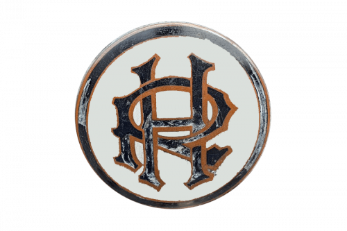
Ruston-Hornsby is a British engineering company, founded in 1918. Most of their history, they produced steam and diesel engines for tanks, cars, aircrafts and other vehicles. In the 20s, they produced a number of heavy luxury cars, but they weren’t successful. The RH logo is a red-black & white square. In the center, there are 3D-styled ‘R’ and ‘H’ letters, colored white & black. The white-colored name with a sans-serif font was placed below.


